A Daily History of Holes, Dots, Lines, Science, History, Math, Physics, Art, the Unintentional Absurd, Architecture, Maps, Data Visualization, Blank and Missing Things, and so on. |1.6 million words, 7500 images, 4.9 million hits| Press & appearances in The Times, Le Figaro, Mensa, The Economist, The Guardian, Discovery News, Slate, Le Monde, Sci American Blogs, Le Point, and many other places... 5000+ total posts since 2008.. Contact johnfptak at gmail dot com
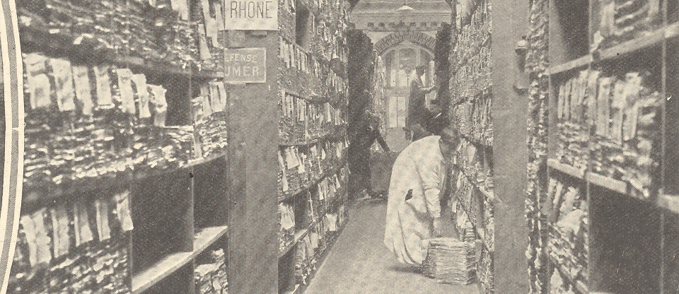
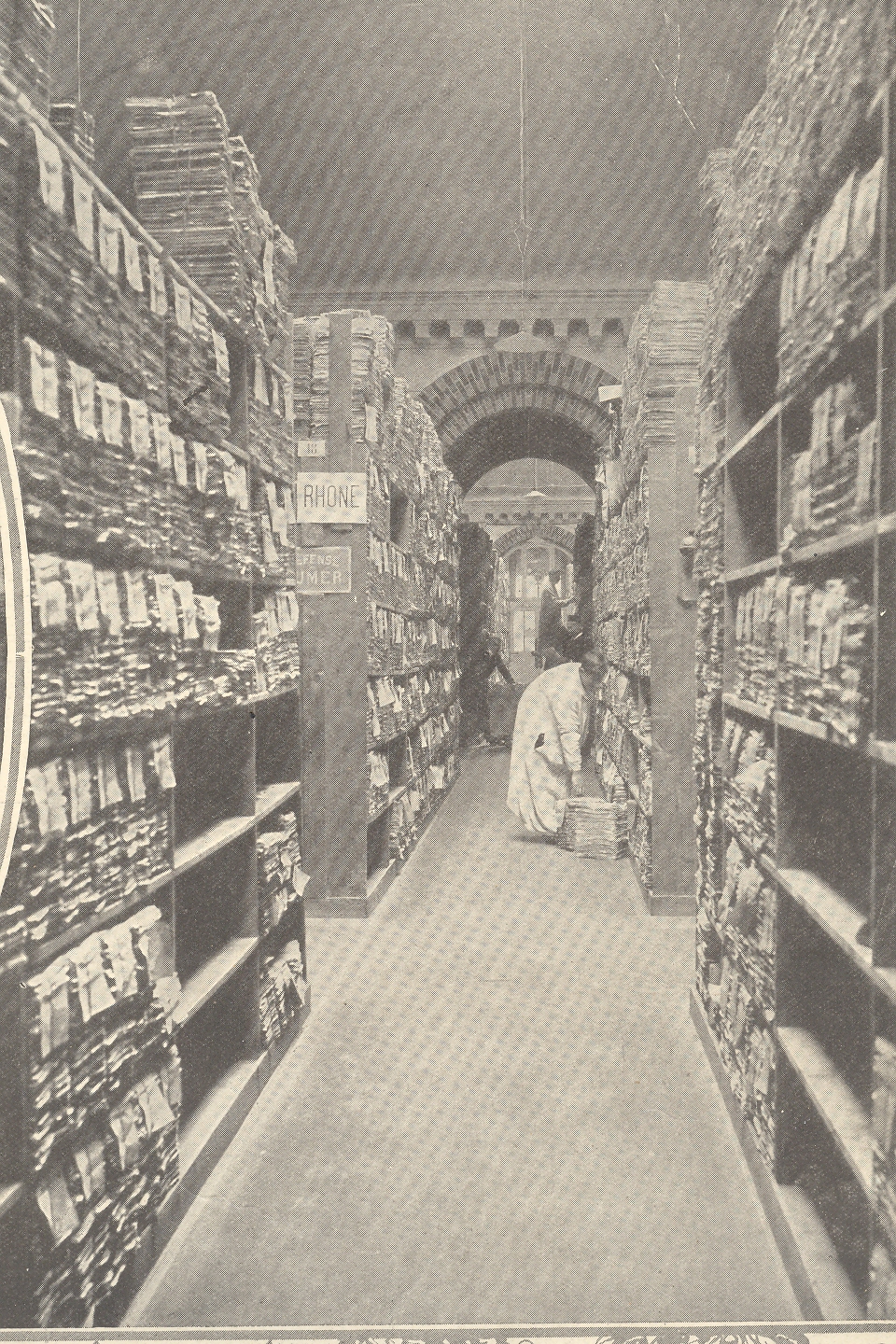
Today’s post on the tabulating office of the French 1911 Census seems quite natural following yesterday’s of the reading-and-writing (French) fireproof man...
Like many other countries, the French were certainly not playing to the technological audience in conducting their census of 1911, the physical, tabulating part of it looking much as it did in the 1880’s.Granted, the United States was dragged somewhat into the new high-tech age of tabulating for its 1890 census, but it was absolutely and clearly shown that the Herman Hollerith machines and methods were vastly superior to those previous used, giving the government extraordinary new insights into the way in which the country functioned—a Hubble Telescope-like impact for those interested in more and more-manipulable data.
What interests me in these photos are the endless stacks of paper, and what I imagine was the quiet of the job of the paper-stack-classifier, all of whom seem to be heavily dressed…I guess that you couldn’t keep a dry heat around exposed paper like that for fear of (a) well, possible fire and (b) drying the documents out and making them fragile and unusable.
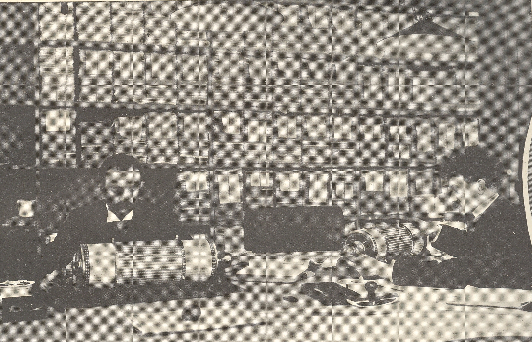
The image below shows two men using the Thacher Calculating Instrument, a large, cylindrical slide rule1.
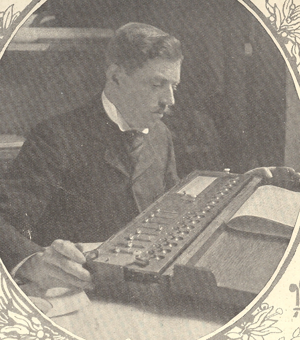
This man is using an arithmometer, invented by Charles Xavier Thomas de Colmar in 1820. It was employed, as we can clearly see, well into the 20thcentury even though it had been far superseded.
The U.S. government, on the other hand, wasn’t so much taken by the astronomical range of new statistics that flowed from the Hollerith machines as it was the astronomical bill for their use.The 1880 census had cost about $6 million and took 9 years to tabulate; the 1890 census using the Hollerith machines cost $10 million and took seven years.The main focus of many in government was the cost differential—not the incredible amounts of new controllable information.The rent of the Hollerith machines was only $750,000 for the conduct of the entire census, so the differential must’ve been in the extra utility costs (for electricity, for example, which was used for the first time to run the tabulators) and for the small army of statisticians and data entry people.Be that as it may, the government was not amused, particularly when Hollerith figured that he had actually saved the government $5 million.The two parties left each other grumbling, though the roar of the trickle down from the Hollerith success drowned it out.The tabulating system was quickly exported, and large private concerns in the U.S. saw a savior in the system that would soon rescue them from the sea of paper in which they were beginning to drown.The Hollerith company did very, very well for itself, and soon merged with three other companies (in 1911) to ease the burden of success.The resulting company was called the Computing-Tabulating-Research Company (CTR), which after a short while became the International Business Machine Corporation (IBM).
Image source:The Illustrated London News, 11 March 1911.
Notes:
1.The following description is from the wonderful SlideRuleMuseumsite;
“Thacher's Calculating Instrument - Patented in 1881 by Edwin Thacher. Originally made by W.F. Stanley, in London, but, by 1897, Keuffel & Esser had taken over production. an 1884 instruction book notes, "The original rule in use is 12 inches long, with radii of II and 5 1/2 inches, the divisions of which are cut by hand, copying from a machine divided plate. In the present instrument the radii are 60 and 30 feet, the divisions of which are printed directly from machine divided plates. Those plates contain over 33,000 divisions, calculated to seven places of decimals from Babbage's tables by using a common multiplier, every line being subjected to correction for error of screw and temperature variations, so that possibly every line center is within .0001 inch of its true place." The instrument consists of a cylindrical slide, which admits of both rotary and longitudinal movement within an open metallic framework of 20 equidistant triangular bars. The bars are connected to rings at their ends which admit rotation within standards attached to the base. Upon the slide are wrapped two complete logarithmic scales, each of which is divided into 40 parts of length equal to half that of the slide. The parts follow each other in regular order around the cylinder, and the figures and divisions which constitute any part of the right are repeated on the left, one line in advance. By the rotary and longitudinal movement of the slide any of its divisions may be brought opposite to or in contact with any division on the fixed scales. The divisions on the upper lines are transferred to the slide by means of a pointer fitting over the bars, which is also convenient for retaining the position of any division on either line while the slide is being revolved into the required position. Near the commencement of each scale on the slide is a heavy black mark designed to catch the eye.”
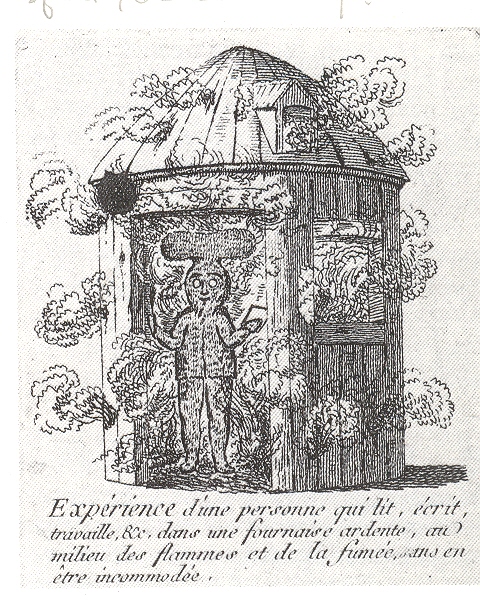
There’s not much that I can say at this point about C.J.
Leroux, the author of the work in which
this magnificent engraving waspublished, Decouverte
contre les incendies...1 Without a pretty good library to hike to Leroux’s
efforts remain a mystery to me, except for what I can deduce from the
image.The shack in the image is burning,
and the man inside is fine, evidently protected from the fire by a special suit
made of fire-resistant materials.It is
an interesting idea in protecting people from fire—sidestepping the issue of
making the house more fire resistant by making the people in the house
resistant to fire.I suspect that the
inventor/designer/theorist of such a gown had in mind the sale of millions of
such things—that way if a fire struck a house in a dense section of Paris the entire
neighborhood would don their suits and escpae the flames.The neighborhood might not survive, but the
people would.That might not be the
chief interest of the royals at that time who I am sure would be more
interested in the physical plant and the real estate than the people crawling
around inside it.This display also begs
the question of manufacturing the house so that some portion of it would be
fire resistant which would (perhaps) save neighboring dwelling.
Be that as it may, it really didn’t matter, as the materials
for creating such a suit as the test man is wearing didn’t yet exist. Certainly
nothing existed at the time that would allow someone to read, write and work through
smoke and flames in a fiery furnace (“fournaise ardente”) all the while
withno inconvenience (“en etre incommode”)2. The large mushroom-shaped cap would be a supply of oxygen, I guess; the smile on the face of the suit must betray a secret knowledge as to why the paper and pen are not on fire.
It seems to be a nice piece of different
thinking.
Notes:
1. Full title: Découverte contre les incendies, les dangers des eaux, de l'air méphytique ou contagieux et de plusieurs autres maux qui affligent l'humanité, avec un supplément contre les dangers des voyages et des chutes. Par C. J. Leroux Published and printed by the author in 36 pages in Paris, 1788.
2. The legend reads: “ Experience d’une personne qui lit, ecrit, travaille, &c. dans une fournaise ardente, au milieu des flames et de la fume, ans en etre incommode.”
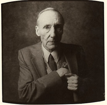
I think that William Burroughs is vastly under appreciated as a driving force behind American mid-20th century dark comedy.For a lot of people the thing missing from reading his books and shorter pieces is the laughter.The few times that I saw him read in the early 1980’s the audience roared—his deep, flat-and-rolling-at-the-same-time delivery pushed this forward, as did the very manipulative lines in his face (which drolly sprang into action at unexpected times, like punctuation marks).In any event, he was funny throughout, a point perhaps lost to folks considering his work as a serious statement on sumpin’ sumpin’. My opinion may very well be a minority, but I see Old Bill as a serious comedian in a dark sweaty Swiftian mold.
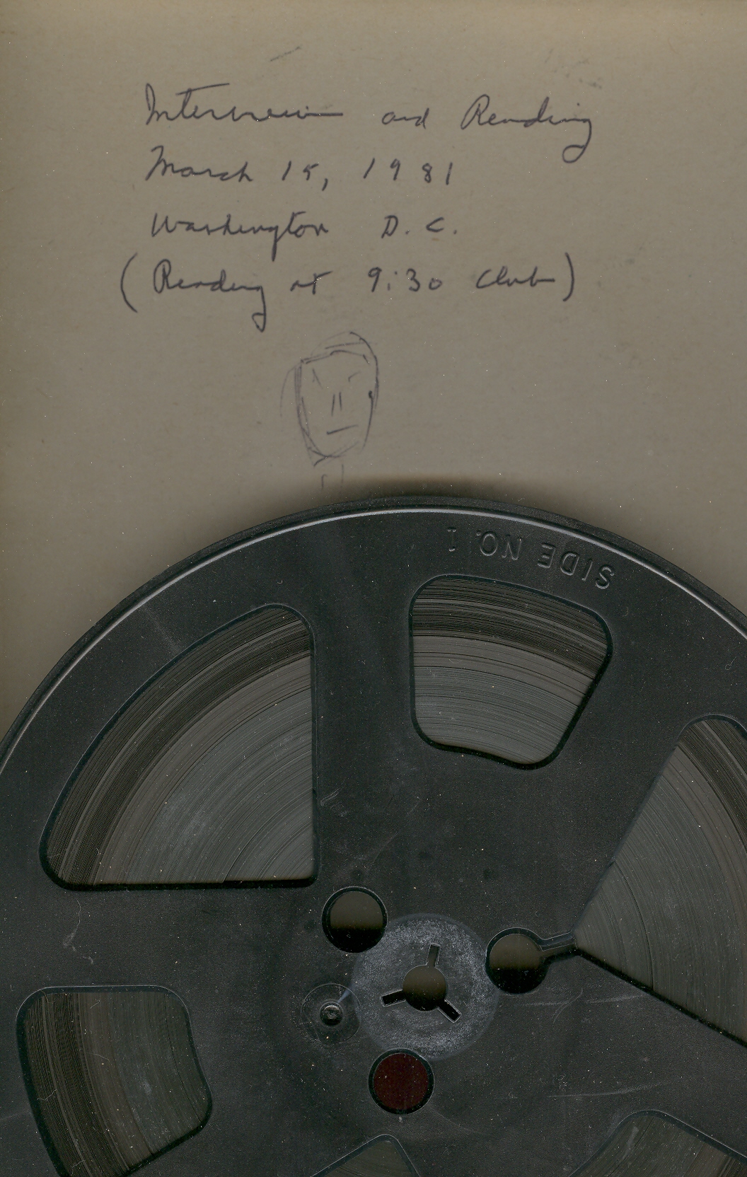
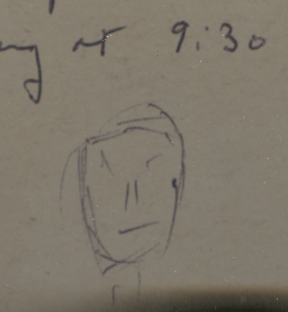
One of the times that I interviewed him was at the 9:30 Club in DC (in its antique incantation, an interesting venue showcasing unusual performers in a ruined brine of alcohol and urine).He was not anxious to be talked to after his reading, and I could hardly get the man to move, though he did become a little animated when pursued about man-machine confluence in the not-too-distant future.At the end of it, I asked—insisted—that he draw a self-portrait, something I had been asking of folks that I was coming into contact with.Burroughs did not want to do it, saying something like ”no one is interested in what I draw myself to look like”.But I told him that I was.And he did it.
He grumbled and flicked-out this disdainful self portrait, a very tentative and light effort compared to the title that he gave my interview (for my reel-to-reel tape box) just moments earlier.
I’ve always found his self-portrait to be pretty creepy—but he did have an awkward and condescendingly dark sense of humor about it--the only thing not missing from the self-portrait was its disturbance(s).
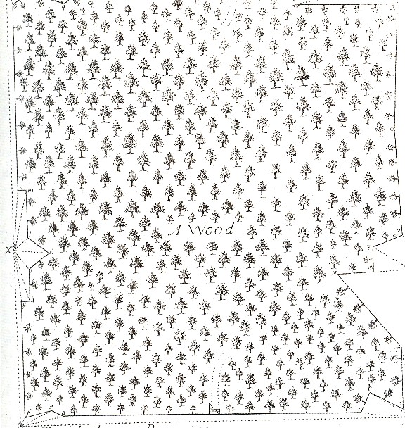
This lovely and lonely engraving comes from Vincent Wing’s (1643-1726)Geodaetes
practicus Redivius1 (The Art of
Surveying…), a book printed in London
in 1700.It is a classic work and much
used for over a hundred years—but I’m focused solely in this illustration for
triangulating in the woods.It is the
image of a stationary forest, a collection of neat trees devoid of movement and
motion and mission, a collection of solitaries, missing wind.I find it remarkable for being an
illustration that manages to show the missing things that you cannot really
see.
1. The full title of this work:Geodaetes practicus redivivus, the art of
surveying: formerly publish'd by Vincent Wing, math., now much augmented and
improv'd, with an appendix thereunto subjoin'd, shewing the whole art of
surveying by a new instrument, called the emperial table : performing exactly
in all respects, and in all cases that can possibly happen in the practical
part of surveying, the work of the theodolite, circumserentor, semi-circle,
chard and needle : with the description and use of a new quadrant : to which is
added by way of supplement, scientia stellarum, containing new and accurate
tables of the planetary motions, whereby the planets places both in longitude
and latitude, the places of the fixed stars, with the eclipses of the
luminaries, are more easily attain'd, than by any yet extant / by John Wing
There’s nothing quite like writing a revolutionary work than
correcting one—and correcting a work that actually needed it.In the world of epochal efforts, that subset
of work that was needed for substantial re-arrangement and correction of The
Big Idea is a small one indeed.In the
period from 1875-1915 or so, when virtually every discipline in the West
underwent groundbreaking change, none that I can think of offhand needed
sweeping revisions, or revisions at all.Granted, you can’t really “correct” Schoenberg or Strindberg or Joyce or
Kandinsky for mistakes, but you can do that for Roentgen or Einstein or Planck
or Boltzmann.But it wasn’t necessary
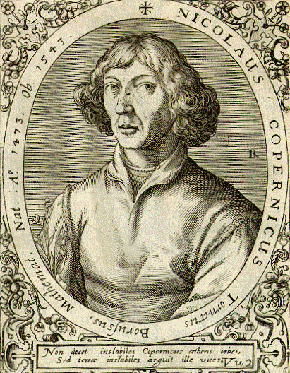
for the big thinking in the sciences.This is what the today-little-known Erasmus Reinhold (1511-1553)
knew needed to be done with Copernicus’ De
Revoultionibus (of 1543)—as attested to so somewhat later by Johannes
Kepler.As a matter of fact, according
to the Dictionary of Science Biography1,
a vast and superb 20-volume keystone repository of necessary information,
Kepler referred to the necessary corrections asa “huge and disagreeable task”(vol XI, p 366) but absolutely essential to make the work less
cumbersome and slow and more handy and, well, useful.
Reinhold’s book, Prutenicae Tabulae Coelestium Motuum, was speedily done and shows
the work of master mathematician, appeared in 1551, delayed as it was for a few
years by war.It instantly became an
exceptionally influential book, computationally brilliant and even superior to
Copernicus, with the Tables2
replacing those of the master, and which were bettered only by those of
Kepler’s own Rudolphine Tables3. Eramus’ book presented the first astronomical tables based
on Copernicus’ work, but the work as a whole slipped by the heliocentric
system, which Erasmus chose to not engage. But he certainly did the necessary
corrections for De Revolutionibus4,
further helpingCopernicus slay the
astronomical monsters of ancient construction.The Principia is
another issue…
Notes:
1.Owen Gingerich, who wrote the “Erasmus” entry for the DSB, referred to him as the most influential astronomical pedagogue of his generation. Erasmus also published a commentary on Georg Peuerbach's Theoricae Novae Planetarum in 1542 as well as one on the first book of Ptolemy's Almagest in 1549.
2.The Prutenic Tables were named for both
Copernicus and the man who financed their publication, Erasmus supporter and
benefactor Duke Albrecht of Prussia
(whose influence seems to have been initially gained for Erasmus by Philip
Melanchton).
3. Johannes Kepler’s Rudolphine Tables(Tabulae Rudolphinae) were
published in 1627 and cosnsited of a star catalog and planetary tables
based on the extraordinary collection of data and observations of Tycho Brahe.
In the preface to De
revolutionibus Copernicus takes on the ancient masters like Ptolemy and
Aristotle with a steel glove:“But meanwhile they introduced a good many ideas which
apparently contradict the first principles of uniform motion. Nor could they
elicit or deduce from the eccentrics the principal consideration, that is, the
structure of the universe and the true symmetry of its parts. On the contrary, their experience was just
like some one taking from various places hands, feet, a head, and other pieces,
very well depicted, it may be, but not for the representation of a single
person; since these fragments would not belong to one another at all, a monster
rather than a man would be put together from them. Hence in the process of
demonstration or "method", as it is called, those who employed
eccentrics are found either to have omitted something essential or to have
admitted something extraneous and wholly irrelevant. This would not have
happened to them, had they followed sound principles. For if the hypotheses
assumed by them were not false, everything which follows from their hypotheses
would be confirmed beyond any doubt. Even though what I am now saying may be
obscure, it will nevertheless become clearer in the proper place.”
5. Copernicus also had some pretty strong stuff to say about the great
early scholar Lactantius:
“Perhaps there will be babblers who claim to be judges of
astronomy although completely ignorant of the subject and, badly distorting
some passage of Scripture to their purpose, will dare to find fault with my
undertaking and censure it. I disregard them even to the extent of despising their
criticism as unfounded. For it is not unknown that Lactantius, otherwise an
illustrious writer but hardly an astronomer, speaks quite childishly about the
earth's shape, when he mocks those who declared that the earth has the form of
a globe. Hence scholars need not be surprised if any such persons will likewise
ridicule me. Astronomy is written for astronomers.”
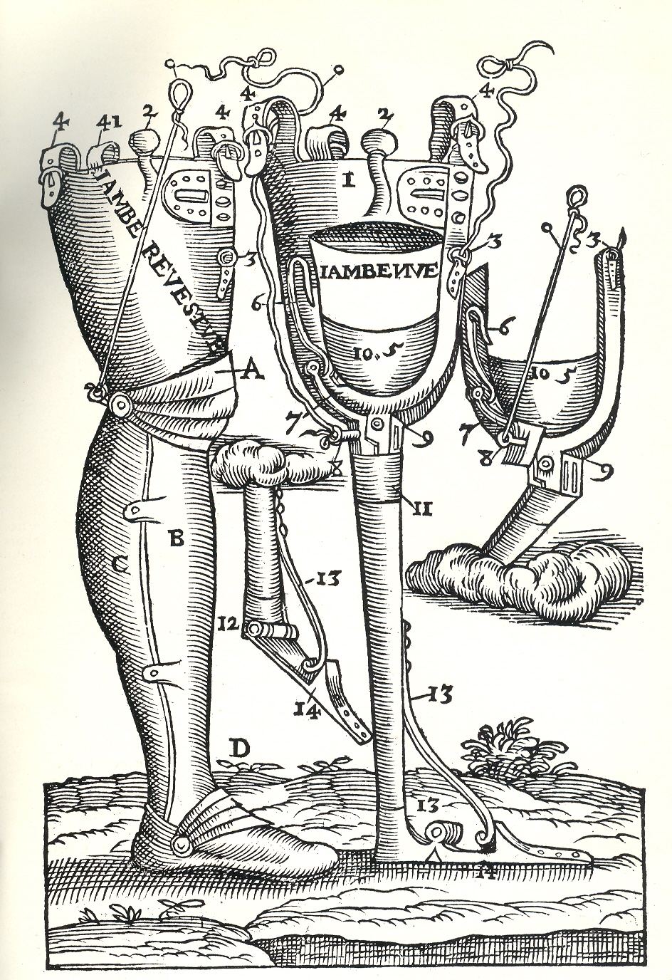
This busy and still beautifully designed woodcut from
Amrbose Pare’s Opera Chirurgica… was
printed in 1594 and holds special fascinations for me.First of all it is a pioneering work on
artificial limbs, and secondly, and tritely, I like the floating ribbons and
ties (some of which seem to come from clouds).First on Pare (1510-1590):this
was a revolutionary work of an extraordinary figure (even though there are some
who suspected that not all of this book was his own work) and was the greatest
surgeon of his era and the doctor to four kings. He was responsible for the
invention of numerous surgical instruments; he also re-introduced the ligature
into surgical procedures for amputations, wrote on carbon monoxide poisoning,
introduced the introduction of induced labor, created the reimplantation of
teeth, was a pioneer of treating battlefield wounds and was one of the first to
write on medical ethics and jurisprudence, and much else.
But I’m sorry to say that I am fixated on the artificial
leg-cloud.And the floating bits.
This brigs me back to a post here from just two days ago on
Antiquarian Dadaism and the emblems of Scarlattini…and which is probably the
only chance I’ll ever have to makefor
connections of feet-from-clouds.Or near-feet
from clouds and the foot of God. In any event, I would like to make it out to be the foot of the creator coming from the clouds to vanquish its squint-eyed and beaten foe. "Triumphator" classically refers to the triumphal parades in ancient Rome, and I guess that this foot could belong to any victor, but since it is after all coming from the sky, I'd like to give that foot to God.
Notes:
Pare’s Opera is
available in toto at the National
Library of Medicine’s superb pages here.
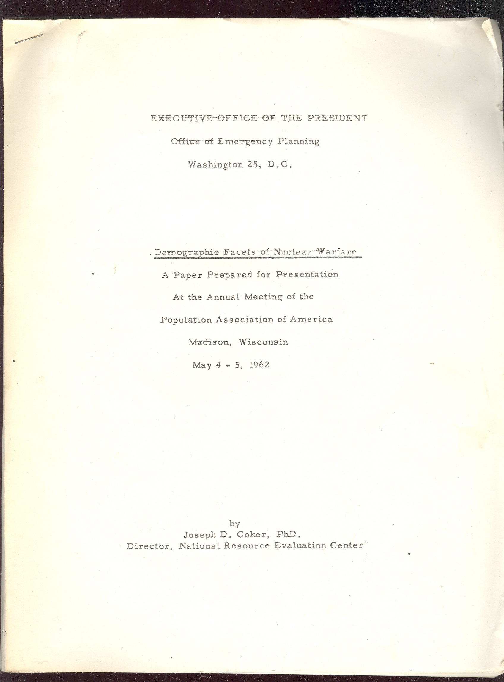
Self- and purposefully-deceptive belief in spectacular
and unsupportable scenarios espoused by governmental leaders which affect the
lives of hundreds of millions of people deserve their own Dante-esque categorization:and that’s one that I haven’t come up with
yet.This post is one of a continuing thread on the history of atomic weapons.
I wonder how it was that we humans didn’t blow ourselves
into melty dissolving bits during the Cold War.Somehow all of those thousands of megatons of disastrously radioactive
explosives that were completely and reliably deliverable didn’t get
launched—not even by accident, not even during all of those hot itchy-finger
DEFCON 2situations.Did MAD (Mutually Assured Destruction )
actually work?Did the attempt at making
a winnable nuclear confrontation keep people from actually trying to do
so?Did the overwhelming and insane
buildup of weaponry actually have so much enormous and foul intellectual weight
that no one could actually make the decision to use the weapons for fear of
snuffing out all human life?
Here’s an embarrassingly shining case in point: Dr. Joseph D. Coker’s paper to the Population
Association of America representing the thinking of the Office of Emergency
Planning and the Executive Branch in general, which freely discussed the survivability
of the United States
following even a post-massive nuclear exchange. Dr.
Coker was the director of the NationalResourceEvaluationCenter, which tried mightily to figure
out how/where /what/how the essential 'stuff” of America could be saved/stored/allocated
after the end of the world.Actually,
Dr. Coker said that the big attack wouldn’t be the end of the world, so we needed
to plan for surviving.
A few cases in point, some of which, I must warn you, are
breathtaking and Strangelovian in their myopia:
Since Dr. Coker was addressing the Population Studies people, he
related much of what he had to say (regarding national resources) to the
American people.He found that millions
of people could be saved if they built a blast shelter (not a fallout shelter)
that was covered with mounds of heavy material and outfitted for an extended
stay of two to 22 days.The unfortunate
part of this scenario, Coker says, is that these shelters work best when 10
miles or more away from a detonation zone.And since these zones were all over the country targeted by thousands of
warheads, very few people (especially in cities) would be outside the 10-mile
ring, which made the blast shelter basically useless.
Coker notes that if an attack of 1000 megatons
[a limited exchange] was aimed exclusively at U.S.air bases, “total fatalities
will approximate 10% of the U.S.
population”.If this attack was aimed at
population centers rather than the air bases, it would kill 40% of the
population. A 5,000 megaton attack on air bases would produce 50% overall
fatalities in the U.S.;
if that amount was centered on large populations, the number would jump to 80%
of the population.10,000 megatons would
yield 75% and 95%, respectively.“A
50,000 megaton attack would kill almost all U.S. citizens under either
targeting assumption”.These figures
didn’t include radiation deaths.
A big variable here not controlled for was the distribution
of population at the time of attack.The
numbers that were used were compiled by the census and counted folks who would
be at home.So, the numbers above worked
if and only if the Soviets attacked after dinner when everyone was at home for
the night.Since it would make sense to
attack when people were at work at their industry or job or whatever during the
day—thus maximizing the effect of the bomb—the casualties would actually be higher.
And what does that mean?Dr. Coker relates this gem (on page 21): “The post-attack labor force
available thirty days after the attack probably will represent a significantly
lower fraction of the population than does the preattack labor force….” And
this: “A nuclear attack can be expected to alter the occupational composition
of the labor force.”
This sort of thinking overtakes the factual aspects of
massive attack, with Coker stating on page 24 “I wish to sayemphatically that it [post-attack America] will
not be anything like that depicted in Neville Shute’s On the Beach.It will be bad enough, but not that
hopeless.”
And this absolutely incredible/horrendous and perhaps worst-use-ever
of the word “awkward”:
For the love of King Neptune’s Pants:Awkward?How in the name of _______ could someone in such a high position and
authority relate massive attacks on every major American population center
which would cover the area in fire and thousands of gigantic highly radioactive
craters in which a city used to exist be called “awkward”?How great a sin was this, to influence
opinion on holocaust via pathetic and unreasonable means?
And then this, on the survivability of our governmental and
economic institutions:
“The post attack institutional environment will depend on
the continuity, resourcefulness and general effectiveness of our leadership and
the survival and resilience of pre-attack institutions…”
Hm?The post-attack
institutions will depend on themselves?
This of course is followed by a major plug for Dr. Coker’s own
work, because the preparations undertaken by the NREC will directly affect the
survivability of post-attack America.So don’t stop the funding.“The more complete and realistic our
preattack [sic] planning and preparations have been and the more effectively
the government is at all levels in inspiring and retaining the confidence and
support of the population, the less drastic institutional changes will
be.”So it is the mealy aspect of
inspiration that will direct the survivability of whatever it is that makes America
so.
I should point out that Coker’s use of “post attack” and
“pre attack” appear as two words, one word and a hyphenated word, depending on
nothing. This is only a forty-page document.
Another nugget on the post-Armageddon future on the
distribution of wealth, mostly hinging on blast shelters:“Per capita wealth in material terms may or
may not be reduced by attack.”There
will be a relatively proportional number ofpeople who emerge from the smoking holes to staff surviving industry,
and so per capita wealth will stay about
the same.If, on the other hand,
people build more blast shelters, then the proportion of surviving workers to
factories will increase, and “the surviving plant capacity will be spread more
thinly among them”. It is left unstated, but what that means is that more successful implementation of blast
shelters would mean a reduction in per capita wealth. Dr. Coker also
forgets what he said earlier that the blast shelters really didn’t work unless
they were more than ten miles from a target.Considering that the industrial workers would be living close to, um,
industry, they will no doubt be (in 1962) in a ten-mile radius to where the
blast would be.Then of course there
would probably be more than one bomb, so the blast area would be more than a
ten-mile circle, and so on and so forth.
In the following paragraph, Dr. Coker somehow draws all
manner of feel-good high-probables around him, encasing himself like a sandman
in a thin layer of improbability, to come to the following conclusion:
“…few of the analysts who have studied carefully these
post-attack [sic] survival and recovery problems take any stock in the
oft-repeated theory that the survivors will envy the dead.On the contrary, after a very rough year or
two, the surviving population, if it so
chooses, can begin to enjoy the advantages of a social structure and a
physical environment not so very different from those which prevailed before the
attack.” [Emphasis mine.]
This is an astonishing work of incredible deceit, and may be
the worst quote of the lot.But it is so
difficult to choose between unacceptable bits of thinking like this, raking out the horrible from the terrible.
Here’s another deceit that was absolutely better understood in 1962
than the writer acknowledges:“The
long-term effects of radiation are subject to much less understanding and
certainty than are the short term effects.There is some evidence that increased radiation exposure results in
reduced life expectancy and increased evidence of leukemia and various
degenerative diseases…”And this:“Genetic effects are more
controversial.”Than what?! And this: “Studies
of the Hiroshima and Nagasakiexperience are said thus far
to be inconclusive.” Honestly this was
very well understood in 1962, and statements like these were enormously
irresponsible if the data were actually misunderstood and criminal if they weren’t.
There are many more examples—I’d say actually that the
entire paper was at the level of Apocalypse Fairy Tale—but I’d like to
close with just one more, this one using another fanciful version of the
possible post-nuclear future and another highly insulting euphemism.On transportation:“We hope in the near future to develop a
family of network and transportation models to estimate capabilities to move
surpluses into deficit areas in
order to cover deficits during each time period and to support the use of more
ambitious resource management techniques focussed [sic] on recovery problems.”Aside from bad sentence structure and
misspellings I could hardly imagine sitting through a presentation where a
person thought this stolen undercooked tripe.What we have arrived at here at the end of the paper is references to
smoke-in-a-hole cities being “deficit areas”, and the successful removal of
human consideration from the conversation—strange as Dr. Coker was addressing the
Annual Meeting of the Population Association of America.(I’d love to know what the association
members thought of the talk afterwards.)
And so what can we draw from the experience of knowing
thinking like this?Is it as sterile as
it might seem, so distant from our experience?The scenarios have changed, as have the leaders and delivery systems,
but the insatiable stupidities have evolved and morphedinto our own time.Its easy to raise our eyebrows now on the
whole MAD approach and the writings of people like Dr. Coker.The truth of the matter is that we have
plenty of this sort of thinking going on right now, big head-waggers that will
loom in our futures with the attached questions of “how could this have happened?”.WMD is one of the many examples of this, a
Big Lie that was repeated for years and which ultimately cost the lives of many
thousands of people and a great perpetuator of the culture of fear.President Bush
drove that one into the ground and so far as I know still employs it when
necessary, threatening listeners with fear of those three letters like they
were a practice hand grenade.(I recall
that a far-right radio personality filled with afterbirth
blood and urine eyes said that he would resign his show “in a year” if WMD were not found in
Iraq; that was five years ago, and of course he is still there, bloated and
ponderous and mostly violently wrong as ever.)The Savings and Loan debacle.The
deathly ambitious practices leading to our recent depression.The billion malnourished and desperate children in the world.And so on. The point is that there is no
paucity of thinking displayed by Dr. Coker in the past, and there is definitely
no lack of it right at this very moment.The
problem is seeing it for what it is in the present and to not have to wait for the future to get to the truth of the matter.
[And how can I end this discussion without a bit more of Stanley Kubrick's magnificent Dr. Strangelove.., who pointed out these absurdities better than,perhaps, anyone?]
Ah, don't fret! The ending is just below (and just when you are about to laugh ("Mein Fuhrer, I can WALK" the other and last shoe drops.).
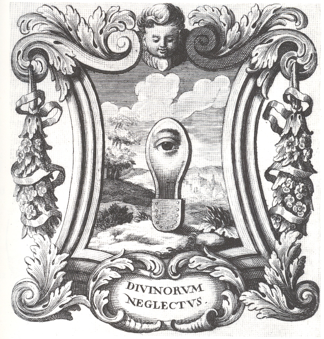
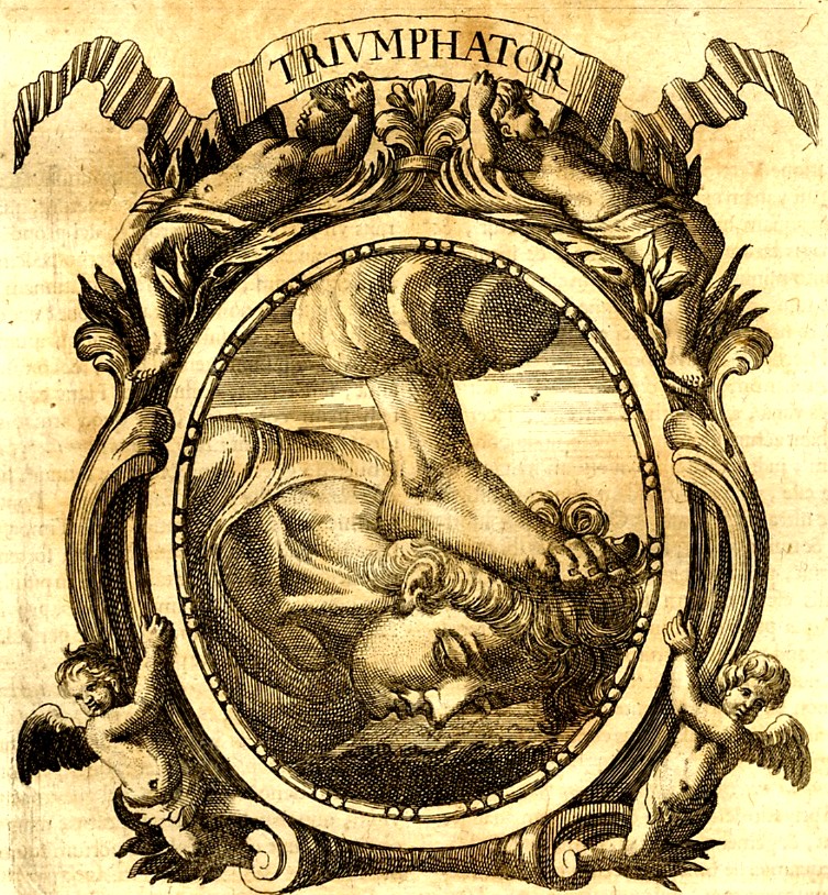
I found these iconographic images by Ottavio Scarlattini1 (1623-1699)
simply irresistible--and even though I really don’t quite understand them (at
least in their correct and original sense and intention), lost to me as they
are to a more classical education and deeper understanding of Baroque
symbolism, I can imagine plenty of re-iconographized (?!) meanings. Not having a more specialized knowledge to
understand their published intentions perhaps allowed them to have a strangely modernistic pull on me, making many
of these Scarlattini designs seem more Dadaist than a 17th century work
displaying visual characterizations of morality tales wrapped around human
anatomy. .Ifyou changed the vocabulary to interpret this
artwork—or just simply removed its intention-- it changes its era, and moves
very cleanly into the genre of the surreal.It feels to me that this sort of transformation is not at all common,
especially when you move the centuries and the genres so crisply and
elegantly.
Doesn’t the “Divinorum Neglectus” suggest something that could’ve
been produced by more-antiquarian versions of Raoul Haussmann or Hannah Hoech or Paul
Delvaux?It does me.If you made this a three-dimensional piece it
could feel like Ernst or Duchamp, its emblematic/hieroglyphic nature
transforming before your eyes.(I wonder if Duchamp or Dufuy were influenced
by the iconographists from this period?)
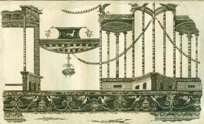
This transference game works nicely with other emblem books, and even with some of the large and spare frescoes from Herculaneum when rendered in black and white as engravings...and also for some of the Framenti of Piranesi, but not too many other places in Western art. Yes?
An engraving of a fresco from Herculaneum (printed ca. 1760):
Notes:
1. SCARLATTINI, Ottavio HOMO ET EJUS PARTES, FIGURATUS ET SYMBOLICUS,
ANATÓMICUS, RATIONALIS, MORALIS, MYSTICUS, POLITICUS, ET LEGALIS, COLLECTUS ET
EXPLICATUS CUM FIGURIS, SYMBOLIS, ANATOMIIS. opera et studio R. D. Octavii
Scarlatini,. nunc primum ex italico idiomate latinitati datum a R. D. Matthia
Honcamp, (.). II volúmenes en un tomo. L. Heckenauer grabador, and printed in
1695.
Scarlattini produced one of the great masterworks of
emblematic knowledge while at the same time writing on human anatomy and
physiology.
Images of
sacred interventions stopping the spread of disease is puzzling, as in this
powerful and disturbing vision of Our Lady of Guadalupe appearing above the
city of Mexico
in 17371.Mexico City was in the second year of a
devastating cholera epidemic where 40,000 had perished in that city alone.
I wonder why Heavenly intercession didn’t
come earlier?Of course the people of
the Valley of Central Mexico could’ve used some
heaven-sent strong-armed virtuosity many times over the centuries.In Mexico
City during the Cockuliztli epidemic of 1576 the
population of the non-Spanish (Native) population fell 50% in just a few
years.Over the period of 1545-1548 70%
of the population of the city nearly died of hemorrhagic fever.This epidemic was followed by many other
(major) epidemics (1576-78, 1629-1631, 1736-1741, 1761, and so on) involving
whooping cough, measles, typhus, smallpox , influenza, cholera, and of course
famine. Cholera—like this epidemic in Mexico City—according
to Rodolfo Acuna-Soto’s study2 seems to have been the least of the epidemic
worries in the Valley
of Mexico over the last
500 years.According to Robert McCaa’s
study of population studies3, 11 authoritative studies on the decline in
population in Mexico from 1519-1598 show an average and disasterous decrease of
about 50%4.
So with the
dozens of epidemics, the invasion of Europeans, and natural and unnatural
famines, I would have expected to see more demonstrations of charity from above
rather than this one skimpy display in the second year of a lower-echelon
epidemic.
1. From Caberra y Quintero Escudo de Armas de Mexico..., printed in Mexico in 1746. There is much else of interest in this book--which is probably the best and most famous of the local histories of the city--besides the image that I fixated on.
2.
[Rodolfo
Âcuna-Soto.] Forum on Microbial Threats//Global Climate Change and Extreme Weather
EventsDecember 5, 2007“The use of Historical data sets inUnderstanding Ecosystems Responsesto Climate Change and the Importance
ofLong-term Monitoring
Programs…”
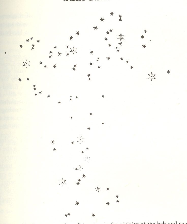
This installment of the continuing thread on the history of dots questions the sublime machinery of the primum mobile in the work of Galileo, particularly in his The Siderreal Messenger (Sidereus nuncius) of 1610. The reception of this extraordinary work was deep and profound, and the images of the “dots” were of extraordinary importance.
The perfection
of the Creator’s plan was being shown to be not-so-perfect in the late Renaissance, a major chink
showing up in the work of the dead Copernicus in 1543, which showed that the
Earth was not the center of the great cosmological eye.In the same year the body was also shown to
be not so much built in god’s image with its bitter working revealed in one of
the greatest anatomy books ever written, Vesalius’ revolutionary De Humani Corporis Fabrica .
Problematic bits
started showing up regularly wrapped in scientific proof:the existence of a vacuum, thought to be
impossible given the perfection of creation, was shown to exist inOtto von Guericke's Experiemnta nova (ut vocantur) Magdeburgica de
vacuo spatio (Amsterdam,
1672).
The
stupendous idea of additions to the night sky, which had been thought to be
immutable and unchanging, came into being with Tycho Brahe’s 1572 discovery of
a new star (Nova) in Cassiopeia and added to in 1602 by Kepler’s announcement
of another new star—both events showing that the night sky was not complete and
that it was actually changing.
When you
consider Galileo and his use of the newly-invented telescope it is usually a little
far down on the list of accomplishments that his explosion of the night sky is
considered.In addition to everything he
did (applying mathematics to the study of physics, understanding
the physics of motion, developing the telescope and the microscope and other
precision physical instruments and so on) Galileo pointed the
not-yet-astronomically-used telescope to the sky and expanded the size of the
universe by a factor of ten.It was so
utterly astonishing an idea I can hardly think how the not-prepared mind of
1610 would’ve reacted to the idea.Certainly it was not a happy acknowledgment coming from the Holy
Father, though a simple defense could’ve been that this miracle was divinely
revealed ,and that it was there all of the time but just unknown to humans, and
so not threatening the orthodoxy of Christian belief.But that wasn’t the case, and Galileo would
soon enough be in trouble with the church and its inquisition in short order.
The dots in this image are the dots of never-before-seen stars, part of an
unobserved sky that was revealed only under magnification.The size and scope of the new bigness of the
universe was staggering, and of course opened the question immediately to the
possibilities of yet a larger universe revealed under yet more
magnification.I don’t know the answer to
this, and I wonder where Galileo might have publicly mused about how big the
universe might actually be, and if he ever dreamed about the possibilities of
telescopes that were 15 feet across rather than just two inches, and what those
beasts might reveal.
*I’ve looked at the use of the telescope in the hands of
Galileo before HERE (The Telescope
in Galileo’s Hands: the Expansion of the Universe, 1610).
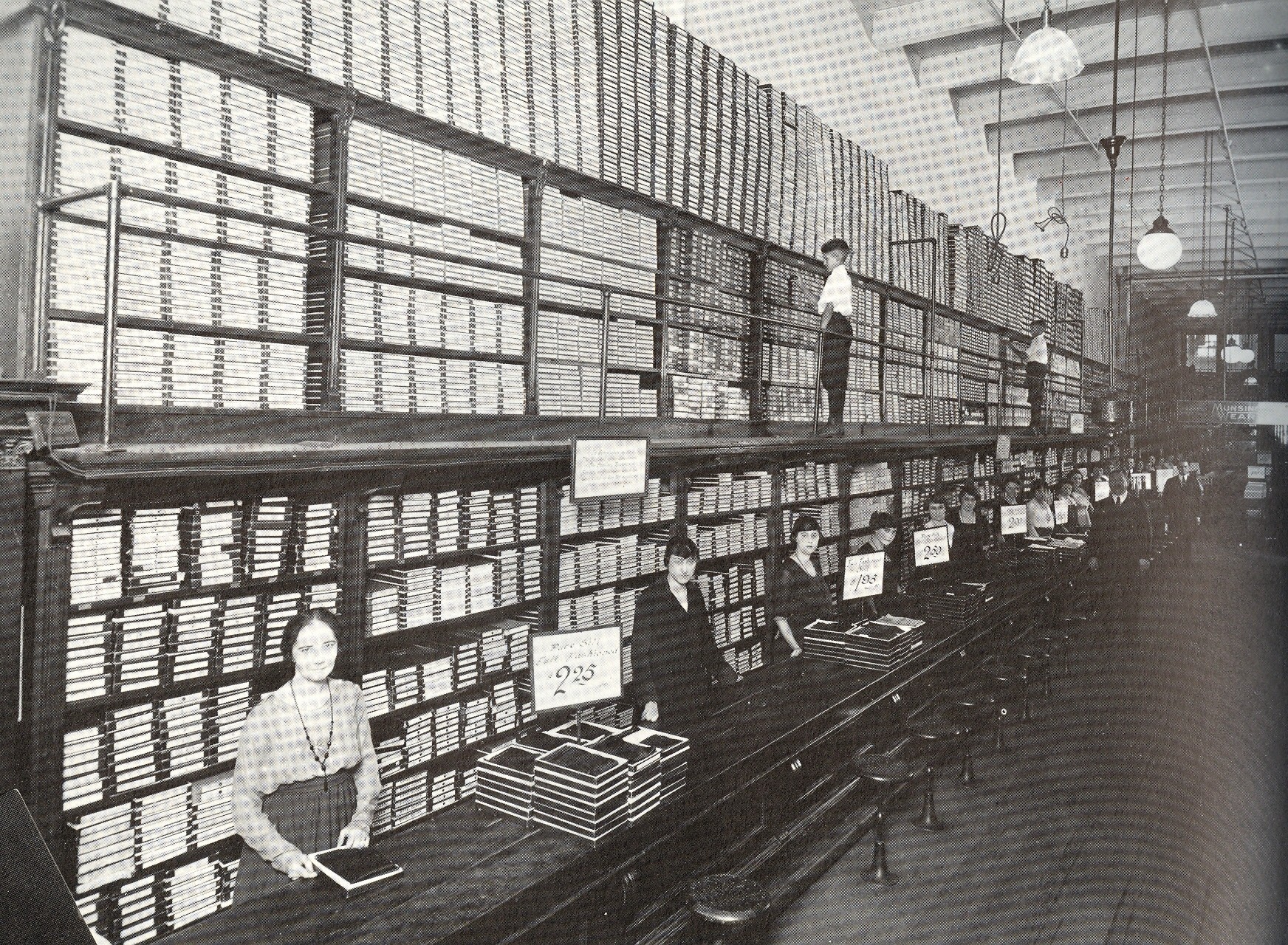
This image from
Michael Lesy’s wonderful Real Life, Louisville in the Twenties--a collection
of interesting and naïve found photographs—has taken a life of its own.It is probably a photo of a hosiery
department (?) for a large clothing store taken during the great halcyon days
of advanced hosiery as this is a very serious collection and display with what
looks like waaay too many clerks to service god knows how many clients all
buying hosiery at the same time.Hosiery
or not, whatever skinny thing it was in those flat boxes looksas though whatever variety or size was needed
by whatever verity or sized customer could be accessed in a minute or less,
sending the customer on their way so that the next one buying unit could be
serviced and dispensed, and so on into the night.
But I prefer to
think of the stuff in the boxes as letters, or words, or just plain old
data:sat for instance instead of this
place being a clothing store it was a department store for writing, and this
was the Poetry Section, selling words by the order, one word at a time.Or perhaps the boxes held images.Or entire ideas—just not entire, finished
works.
And why
wouldn’t data and ideas have been stored and sold like this rather than hosiery
or handkerchiefs?
This got me thinking a little about the
storage and dispensing of information in antiquarian times, about how some of
the writers of great and high-erudite works were actually able to accomplish
their efforts. Deep into the early and future-vision-primitive history of
online digital exploration, it is difficult to imagine producing works of
sustained viability using combinations of only (private) libraries,memory palaces1, correspondence and notes. Today the internet accounts for less than 1%
of the time of advanced scholarship in all ofhuman history, but it has probably accounted for significant
contributions to half of all the academic stuff that has ever been written--and
we’re all probably terribly spoiled by the instant access to info in our
datacentric existence.
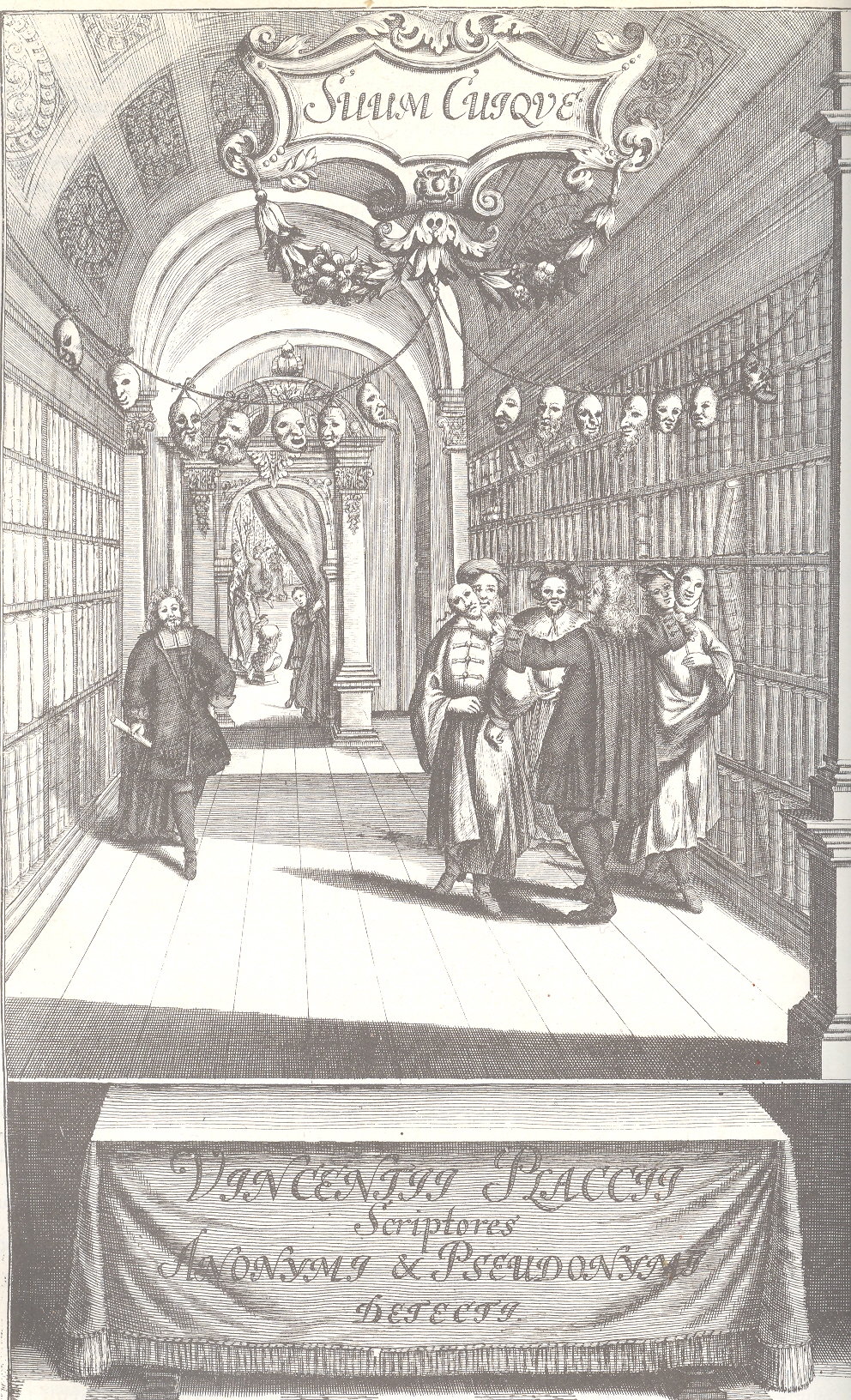
My own digital addiction in mind, I marvel at
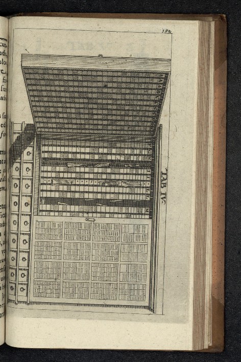
the accomplishments of people like Vincent Placcius (1642-1699), a vastly
learned guy who sorted out 2,777 anonymous publications in 1500 pages, somehow,
three hundred years ago.He wrote a
monumental bibliographical work
(Theatrum Anonymorum et Pseudonynorum2) with superb references, and did so with what
we would today deem relatively nothing.Placcius
did have some sort chest-like devices with rods and pins and god knows what
that functioned in a way I don’t understand as a note-keeping/comparing
device.I’ve included images of the
device (below) in the hope that someone out there might recognize and explain
it.In any event, this superb piece of
scholarship—the first of its kind—had to have taken a lifetime of reading and understanding
and investigation to reveal.The
frontispiece to the book shows the author ina library unmasking two anonymous authors, the masks of other conquests
linked above him on a chord.
Another example in the how-did-they-do-it
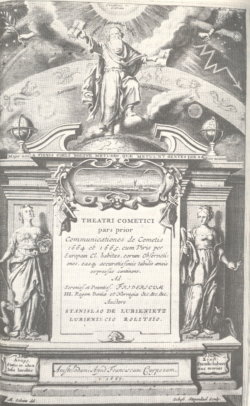
category is Stanislaus Lubienitzky’s (1623-1675) Theatrum Cometicum…(1667), a powerhouse of data on all things
cometary.Lubienitzky recorded all
manners of observations and reports of all comets ever recorded in extant
chronicle or published work. Ever.It is
a vast and learned work of incredible determination.
NOTES:
1. See Frances
Yates for the great standard on memory devices, The
Art of Memory (1966).And as
long as we’re at it, her Giordano Bruno and the
Hermetic Tradition (1964) and The Rosicrucian Enlightenment
(1971) are also terrific works on a very high order.
2.Theatrum Anonymorum et Pseudonynorum2, Ex Symbolis & Collatione
Virorum Per Europam Doctissimorum Ad Celeberrrimorum, Post Syntagma Dudum
Editum, Summa Beati Auctoris Cura Reclusum...1708
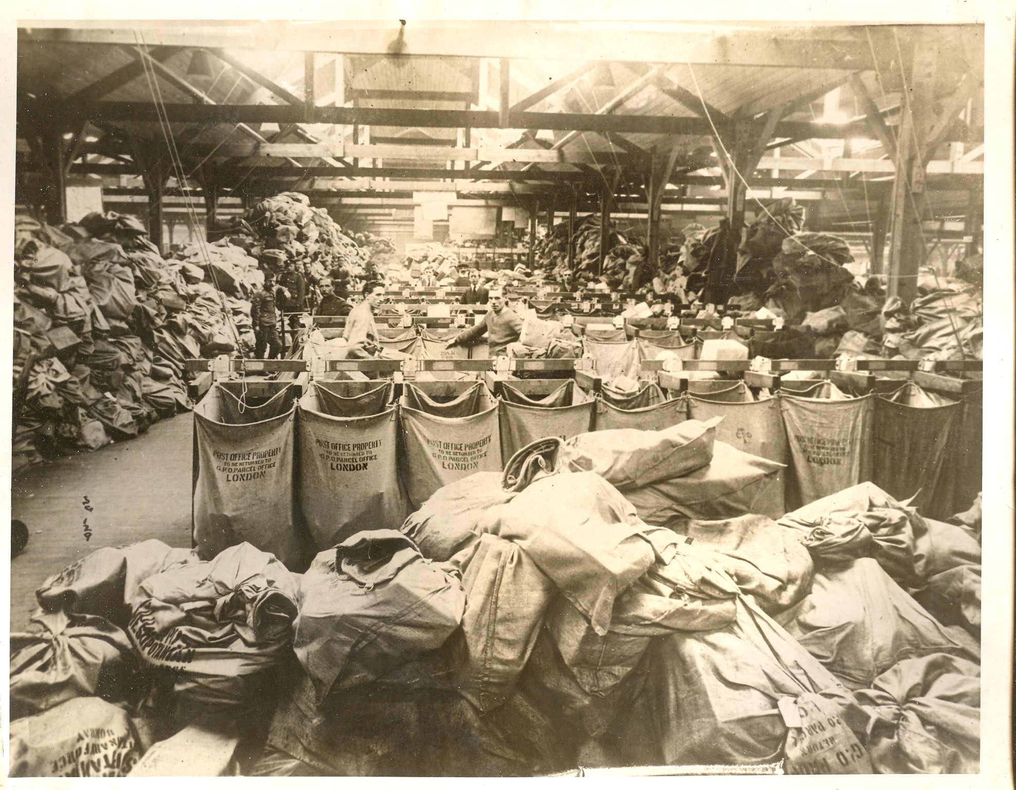
This is the U.S. Army mail depot at Regents Park, London, braced for and under siege by Christmastime mail in 1917. It strikes me that there are not a million items in this photo--at this time in the war there were something like 35 million people in the services for all countries dedicated to the war effort, which is approximately half the number that served in total. If these letters in this picture were bodies, I reckon that there would be five more rooms like this necessary to tell the visual picture of the war dead and wounded. This aside, I initially focused on the guy in the rear with the white shirt and tie, standing there pretty much overwhelmed by the task of moving all of that stuff...and perhaps with the idea that much of the mound would wind up being undeliverable because the recipient was killed. I wonder if that mail was returned, or not?
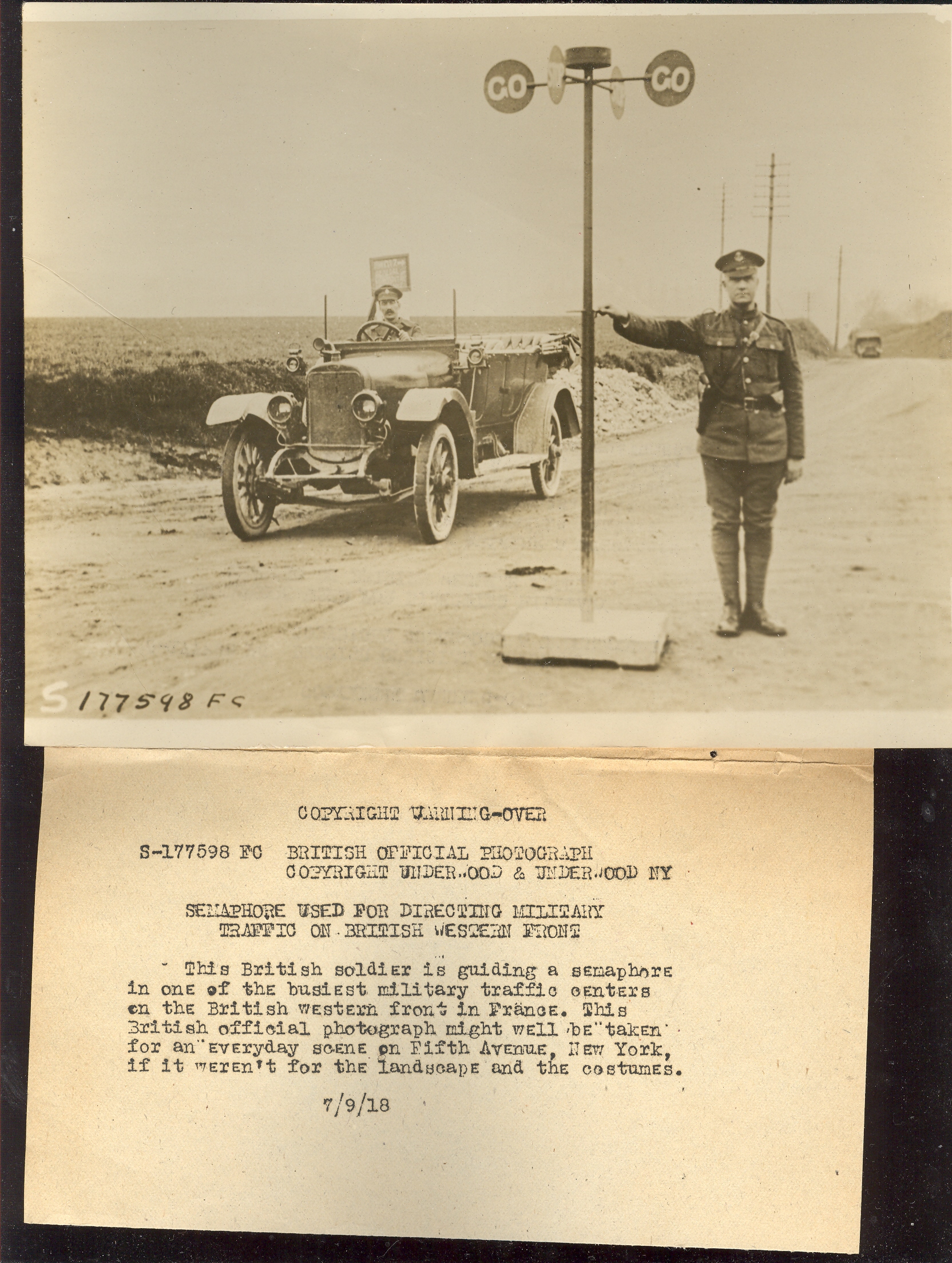
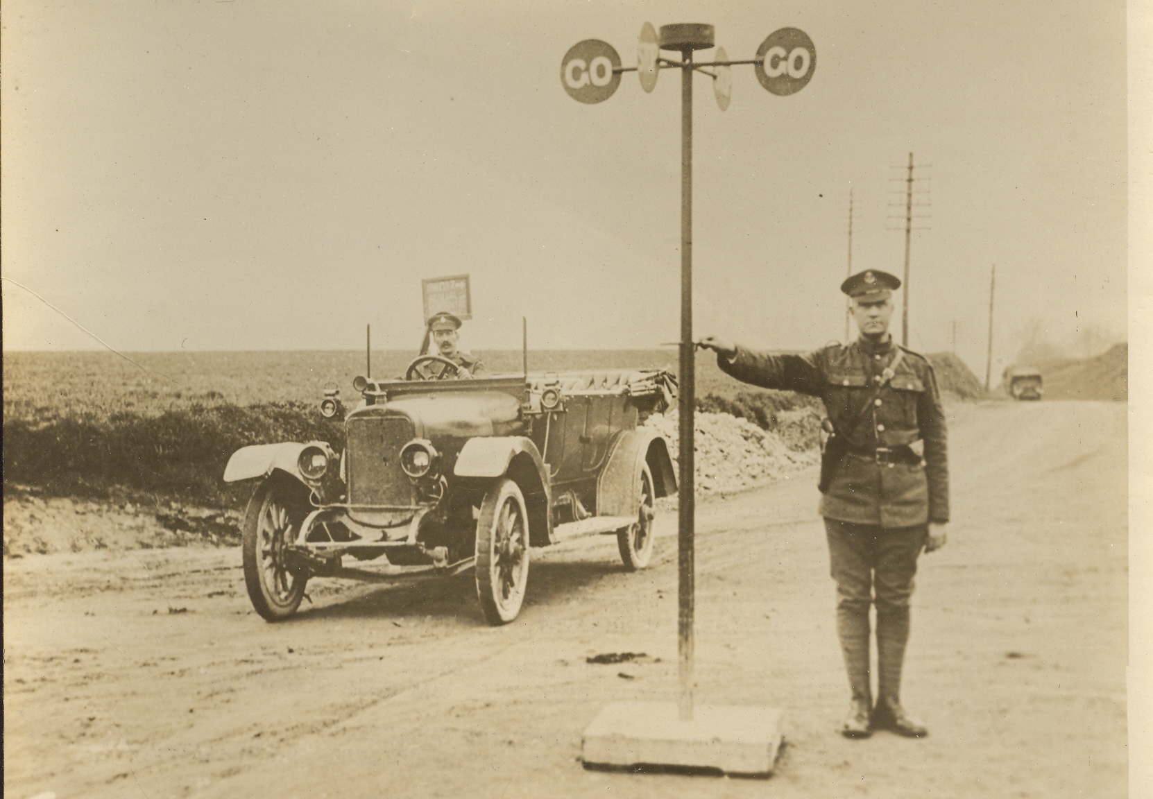
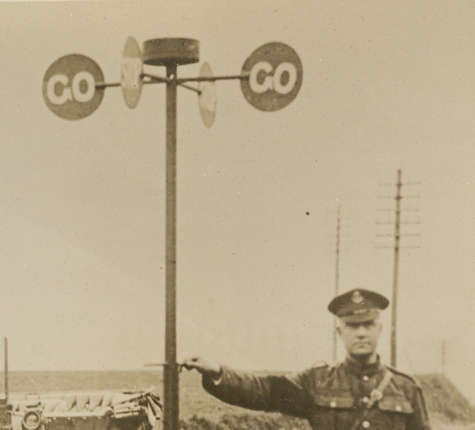
On the other end of the spectrum is this bizarrely-titled photo of a
British soldier "guiding" a traffic signal device...the description
says that this is the busiest intersection in all of British-occupied
France. Maybe so, but not at this particular time. Perhaps the
photographer should've waited a bit to get a different sort of picture
to make his point, rather than settle for this lonely (if not
beautifully arranged) situation.
Here's the image without the accompanying text, which was supplied for the end-user of the photo by the news service photography supplier.
This sort-of
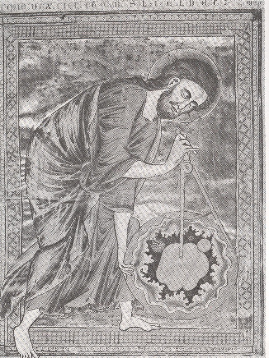
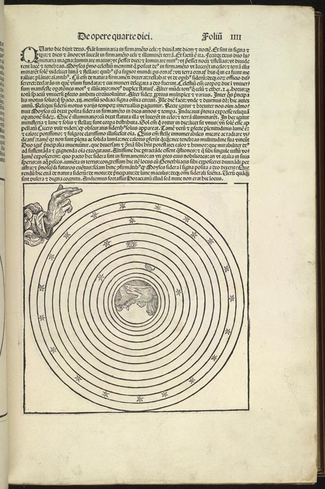
famous image, found in a French Bible
Mortalisee made in Reims in the 13th century,
displays The
Creator measuring its creation, a sphere of the universe containing all of the
stuff of creation, and including the Earth (pictured at upper right).At least that is what I think this is—Creator
stepping into the frame (its right foot outside the drawn border of the image),
holding everything that it has made, and holding it all in the midst of another
environment of some sort.What that
place might actually be, I don’t know.Is that the space in-between the light created on the fourth day
(pictured below from Schedel’s so-called Nuremberg Chronicle of 1493), the space
that wasn’t the greater light to rule the day and the lesser light to rule the
night?In this spirit it was the stars
that were supposed to separate these two lights, but the stars themselves in
many of the concentric circle cosmologies weren’t part of the Heavenly sphere
itself, which is what the Reim’s illustrations seems to say.I suppose that it is all simply displayed
somewhere in the OT, but from where I sit right now, this looks like a
painfully early Western image of multiple universes.
The other thing is: what is the Creator looking at? It is definitely very focused and wide-eyed, and is lasered on something about half of the diameter of the universe to the right, just on the other side of the dividers. Is this the biggest of the Blank and Empty Things that can be imagined?
"Malone. … My father died of starvation in Ireland in the black ’47. Maybe you heard of it? Violet. The Famine! Malone (with smouldering passion) No, the Starvation. When a country is full of food, and exporting it, there can be no famine. Me father was starved dead; and I was starved out to America in me mother’s arms. English rule drove me and mine out of Ireland . …" --George Bernard Shaw, Man and Superman (1903)
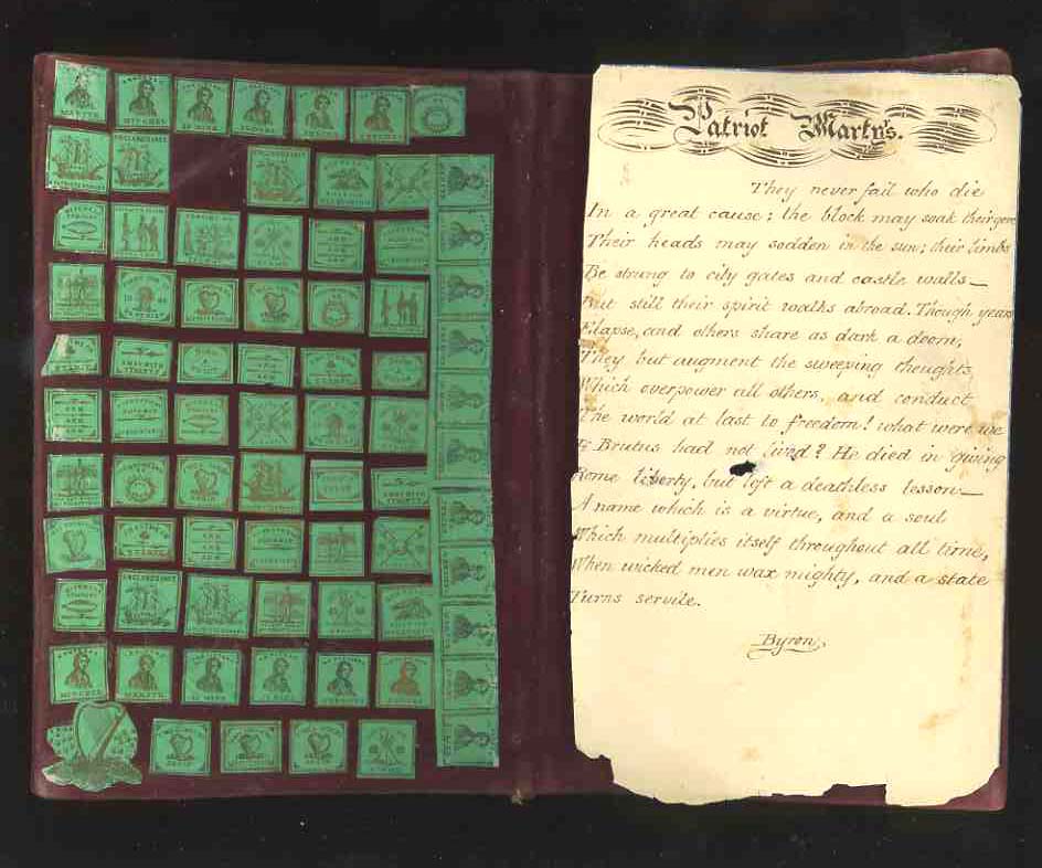
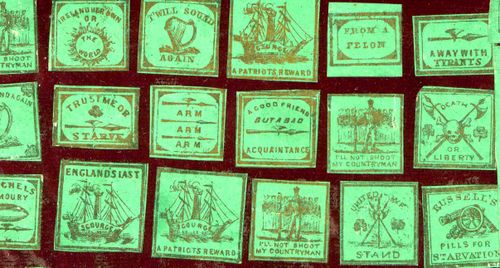
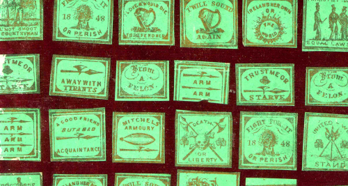
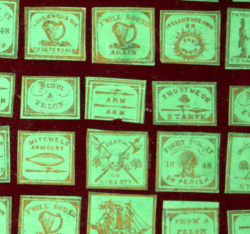
"The Almighty indeed sent the potato blight but the English created the famine...a million and half men, women and children were carefully, prudently and peacefully slain by the English government. They died of hunger in the midst of abundance which their own hands created."--John Mitchel (1815-1875), Irish Nationalist (and listed as a "martyr" in one of these badges/stamps)
I'm sorry to say that I do not know the origin of these diminutive, powerful emblems, and that what follows is all guess-work. They are only about a half-inch square or so, but they hold very powerful meanings in their messages. I imagine that they were political messages to be worn, or posted in the mail, or used in subversive ways--because their messages were enormously subversive, taking on the occupying power of Great Britain at a time of supreme and enforced deprivation, an occupied people fighting against a spectacularly-better equipped foe. The messages related to the Great Famine of 1847-1849, when the potato crops failed for three consecutive seasons , initiating a chain of events that caused the deaths of perhaps two million people, or 20% of the entire population of Ireland. People didn't starve so much as they did die of associative diseases related to the process of starving to death, al of which it seems could have been addressed by some sort of effort by the British government. It does seem to me as though the people of Ireland were left to flounder and drown. The stories of the extreme deprivation are horrible: starving dogs digging up the bodies of the recently unguarded dead, rats attacking the dying for food, and so on. Terrible, miserable stories coming from what is probably the worst of period of starvation in European history. the scene has been duplicated numerous times in this century killing hundreds of millions of people:: in Soviet Stalin's filthy anti-human pogroms, under the equally filthy Maoist adventures in production and nationalist strength in China, in Biafra, in Darfur, and on and on in our frailly stupid political existence here on Earth.
The small badges have always seemed somewhat sacred to me; there's just such a feeling of hope and inspiration and overwhelming empathy in them.
I'm always ready to see different and interesting methods of displaying quantitative data, and this work--published in LIFE magazine in 1942--certainly fits that category. That the ship losses are printed in reverse--white on black--is unusual in itself, but the design is just particularly good, fitting a lot of data on a single sheet of paper. The image dramatically displays some very good (and very welcomed) news for the American public as the campaign for the Pacific dug in. This was a major Allied victory in November 1942, and one of the pieces of the end for a campaign that stretched itself out over three years.
--Solomon Island WWII battle chronology found HERE.