

Dr. Seuss and the 236 Words that Changed Reading Forever
JF Ptak Science Books--Repost Blog Bookstore
Repost of an earlier post here on the immortal The Cat in the Hat in honor of Dr. Suess' birthday, today. (Full entry here).
I was reminded in my Asheville neighbor Marty Weil’s wonderful blog on all things ephemera of the importance and long-term significance of Dr. Seuss
(Theodor Seuss Geisel, 1904-1991, and son and grandson of
brewmasters). I think that it is impossible to calculate the overall
impact of Seuss’ bringing young people to the joy of reading, and,
actually, to the familiarization of kids with the bare mechanics of
reading. Of course he told a great story, but his books were literally
page-tuners—they were simply written with words useful to children,
with few words per page, thereby allowing the child to see the
pictures, read all of the words, and turn the page, giving them a sense
of accomplishment along with enjoying a fine story. Perhaps it is
the getting-the-kids-used –to-reading that was his most fantastic
accomplishment—and something that few others have achieved, measuring
by just pure numbers.
of Dr. Seuss
(Theodor Seuss Geisel, 1904-1991, and son and grandson of
brewmasters). I think that it is impossible to calculate the overall
impact of Seuss’ bringing young people to the joy of reading, and,
actually, to the familiarization of kids with the bare mechanics of
reading. Of course he told a great story, but his books were literally
page-tuners—they were simply written with words useful to children,
with few words per page, thereby allowing the child to see the
pictures, read all of the words, and turn the page, giving them a sense
of accomplishment along with enjoying a fine story. Perhaps it is
the getting-the-kids-used –to-reading that was his most fantastic
accomplishment—and something that few others have achieved, measuring
by just pure numbers.
And the way in which he did this was to artistically use an extremely limited budget of words—Dr. Seuss used precisely 236 different words to write The Cat in the Hat...
Continue reading HERE.
|

Mobile Maginot: Movable Land and Floating Forts, 1940
JF Ptak Science Books Post 959
Nothing quite exceeds like excess said Mr. Wilde (and others) , and he/they could be no more correct when looking at this picture of a Movable Maginot Line—it is a mobile fort, complete with plane launching capacity, two dozen long canons, a crane, and a host of other stuff.
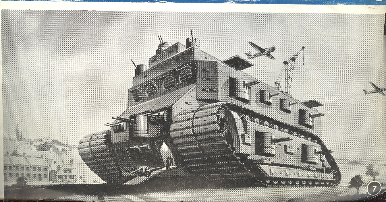
It looks as though it has ample room for all sorts of materiel though leaving little room for, perhaps, an engine. I just can’t see where it might be…perhaps it is near the not-room-enough-for-it-either ammunition compartment. Maybe they were in a smaller armed cart being pulled by the mothership? I reckon that this beast was 66 feet high, 100 feet long and 60 feet wide, which is a very big, heavy near-cube. Good luck with driving the thing in anything that was less than perfect conditions. A big profile like this, filled with guns and canons or not, also makes for a big target profile—a tall, broad target with flat/non-inclined sides. ( I should also point out that there are two 10’ loudspeakers mounted on the front of the fort to instill fear in the people that the thing was approaching with loud noise. The author points out that the Nazis used noise against the French with their “screaming dive bombers”, and so the fort would use the same tactics against the Nazis in the movable fort—not that the sound of the engines and the attendant noise wouldn’t’ve been enough of a fear factor in themselves…)
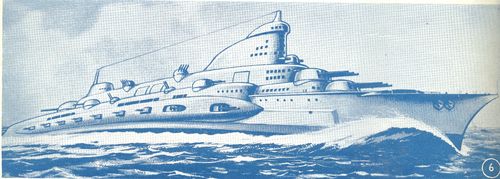
But the image of such a monster, sensical or not, was enough for the purposes of the pamphlet in which it appeared. The Brains to Win was a piece of British spirit/hope propaganda issued at about the time of the Battle of Britain in 1940, and it listed the sorts of technological breakthroughs that were going to push the nation over the top to victory. Some of the stuff was real, some not—like the moving fort/Howl’s Castle above, and the floating fort, below.

I’m not sure where a floating fort would make sense, especially one of that size. (Iterating the figures on deck into distance, it looks as though the deck on the floating platform was 150 or 200’ square. It would’ve looked like a big target from above.) Given the time and expense and material needed for such a thing, it seems that it would’ve been cheaper to make a moveable fortress not quite so big, with less of a profile, and more mobile—I think that this was called a “destroyer” or “battleship”.
But no matter, I’m just poking fun at some of the future vision that became archaic the moment it was drawn, punk retro-future. All the pamphlet was trying to point out in its 32 pages was that overall the Brits were smarter than the Germans and that would be the balance for victory in the war. “Hitler will get some very unpleasant surprises before this is over” the author very politely pointed out, no doubt with one eyebrow raised. The scientists agreed.
And they were right, which is all that matters.
|
Imago Mortis: Immortal and Post Mortem Hair
JF Ptak Science Books LLC Post 958 Blog Bookstore

I think that in the contest of hair between mortality and immortality, never-ending time wins. This sentiment is based on seeing many images representing death and time over the years, not many of which I can not now produce on demand to make my argument a little more plausible, but, well, no matter. Two examples will suffice for now.
The first example stands for many of its type: it is titled "Imago Mortis" (the World of Death) and appears in Hartmann Schedel's Liber chronicum (more commonly known as the Nuremberg Chronicles), one of the greatest illustrated (or certainly the most lavishily illustrated) books of the 15th century. Printed by Anton Koberger in Nuremberg on 12 July 1493, the Liber chronicum was basically just that, a walk through the known and imagined knowledge of the mid-Renaissance with the great humanist Schedel acting in the role of conductor. There's certainly much of interest and disinterest in this book; Schedel was not afraid to make a guess (and even a wild one) when facts didn't fit or were unavailable. (For example, he famously re-used the same view of a city to illustrate different cities.)
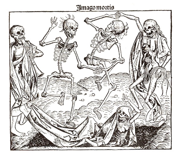
The Imago Mortis here is more like the Dance of Death, a subject visited many times by many great artists over a 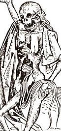 period of 500 years or so. But my interest right now is only in the hair; particularly the hair of the figure at far right, whose (her?) hair seems to be not only flowing down her spine but through it and her ricase as well, spilling out in front of her across her pelvis.
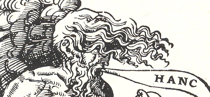
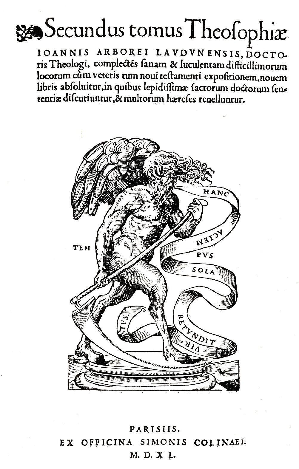 I've written earlier in this blog on the second woodcut image: it appears as the printer's mark (of Simonem Colineum, or Simon de Colines) in the
second volume of Johann Arboreus’ Theosophia, complectens difficillorum…, which
was printed in
I've written earlier in this blog on the second woodcut image: it appears as the printer's mark (of Simonem Colineum, or Simon de Colines) in the
second volume of Johann Arboreus’ Theosophia, complectens difficillorum…, which
was printed in
I think the winner is Time, whose hair--although not quite as long as that of the dead--is far more luxurious, which at the end of the day carries it. Also, Time's hair is connected to a scalp; I don't know what the deads' hair is connected to.
|
Propaganda Maps: Potential Nazi Supporters, 1938
JF Ptak Science Books LLC Post 956
In
an audacious move Adolf Hitler attempted to unite German-heritage people
throughout the world to come to the aid of the Nazi Socialists; it was a
vicious piece of propaganda attempting to inflate the number of possible-Nazis
into the hundreds of millions, showing a sub rosa infiltration of Nazism
throughout the world.

This
map appeared originally in Deutsches
Volkstum in aller Welt (
(I’ve
written about the Nazi-American connections in numerous posts on this blog; all
you need to do is do a site google under “Nazi” and you’ll find plenty. For the
moment I’ll just concentrate on the Henry Ford example. The man was a monstrous moral figure without
an ounce of historical understanding who blamed much of the world’s troubles on
the “Jewish Dictatorship”, which  somehow, in his mind, spawned WWI. Long story short, Ford received the Grand
Cross of the Supreme Order of the German Eagle for his friendship and services
to the Nazi state—this friendship extended in form of money and many thousands
of military vehicles, and so on. His was
a treacherous business, his Nazi interests folding very nicely in with his
astounding anti-Semitism. Ford, by the way, received his medal months after the
invasion of
somehow, in his mind, spawned WWI. Long story short, Ford received the Grand
Cross of the Supreme Order of the German Eagle for his friendship and services
to the Nazi state—this friendship extended in form of money and many thousands
of military vehicles, and so on. His was
a treacherous business, his Nazi interests folding very nicely in with his
astounding anti-Semitism. Ford, by the way, received his medal months after the
invasion of
But
among the masses, the sentiment never grew into strength, though it wasn’t for
trying. The movement had been present in
the
Amyway, this map was more a propaganda tool than one of true expectation, and I’m sure it did its fair share of damage.
|
Graphic Display of Quantitative Data: German Military Flatline in Persepctive, 1934
JF Ptak Science Books LLC Post 955
This terrific 1933 pictorial display of quantitative data1
showing the comparative military capacities of eleven countries—it will become progressively
and aggressively more wrong in each passing year to the start of WWII. In 1933 the military giant was, basically,

The German military forces underwent staggering change after
the end of WWI. The Imperial Forces were
completely done at the end of the war, limited to 100,000 men, left with no air
force and no tanks. There were wide
changes during the
This is an exclusive graphic of German nothingness, an accurate graphic in 1934 and again in 1945, but in the middle, it was totally incorrect. Twelve years from nothing to nothing, with the disgust of Hell to pay in between.
It is simply extraordinary to see the disparities of the Nazis displayed so
Notes:
1. Printed in Die Illustriete Zeitung, 1934.
|
The Great Battle of Sitting and Spitting: Whitney, Texas, 1949.
JF Ptak Science Books, LLC Post 953
“Why,
they must spit two or three gallons a day!
They ain’t died fast enough, these old men!”—Mrs. T.E. Bagley,
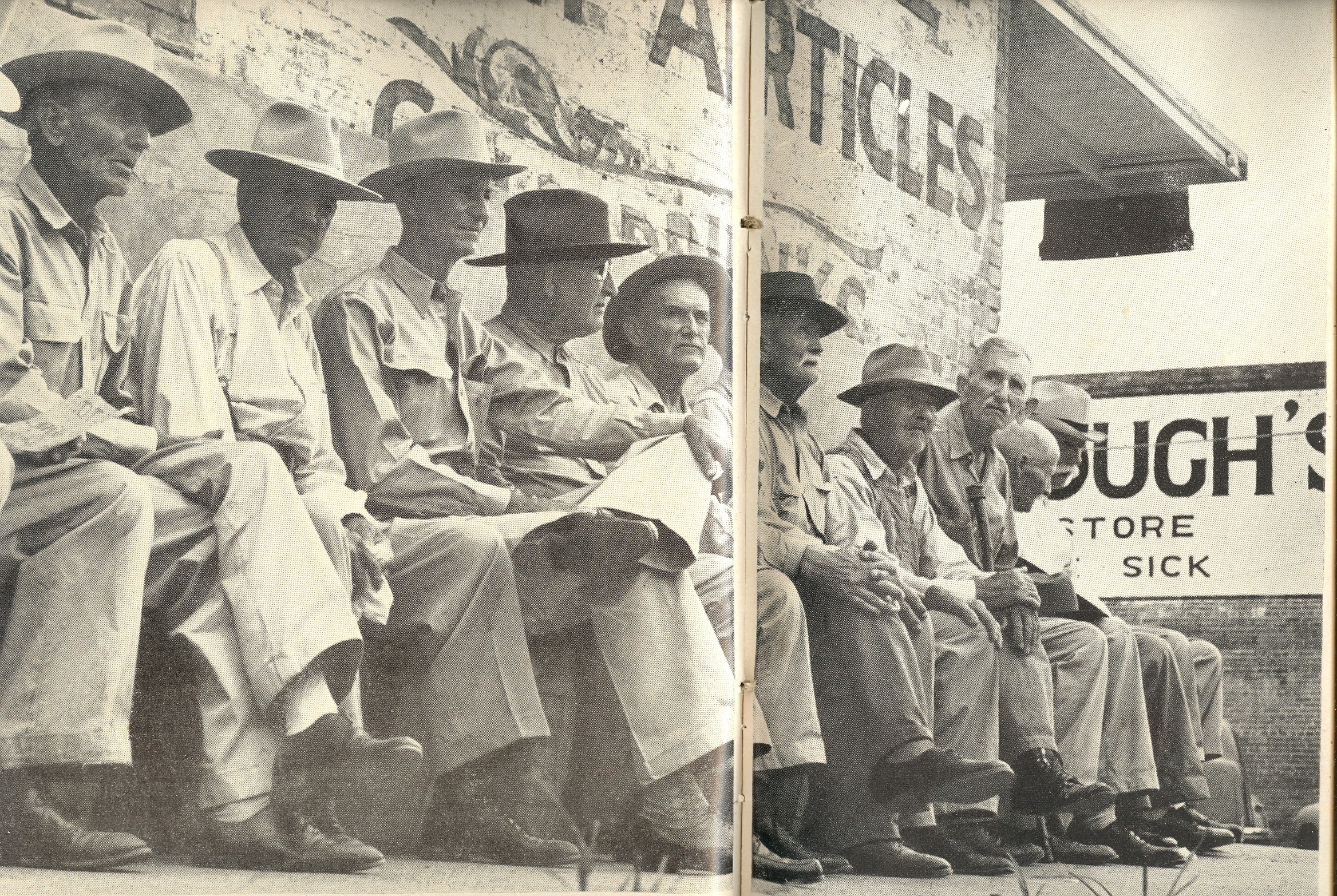
This is a great small America story about sitting. Or old men sitting, and spitting. Sitting and spitting on a long piece of thick timber outside a drug store, bricks and advertisements as back support, in Whitney, Texas (population ca. 1,500), in 1949. I can just about hear them on a hot summer evening, right now, only probably I couldn’t—they’d probably’ve shut up until the stranger walked by, giving me their silence and keeping their confidences. Or not. Maybe I would’ve been invisible, and the whittled bits would've fallen to the street along with the tobacco juice, cusses and gossip, unabated. Maybe they surrounded themselves with a stained-moat of spittin’s across or close to which no one would stray.
It
isn’t, I guess, so much a story about their sitting as it is a story about
their not sitting, about how it came to be that their lumber was removed and
the men forced to find another place to take in the sights and construct their
great edifices of commentary and asides.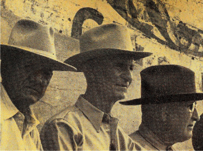
The story appears in LIFE Magazine of 15 August 1949, and lays the whole drama out in two splash pages, with bare editorializing and some great photos.
The
story goes like this: “In 1922 D. (Doctor Dee)
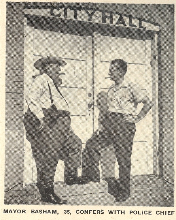
It came to the mayor of Whitney, Frank Basham, to appease “a
delegation of local housewives” who were fed up with the old men, and wanted
the “unsightly bench” gone. It was
probably a lot more than the bench, as the quote above by Mrs. T.E. Bagley contends:
“Why, they must spit two or three gallons a day! They ain’t died fast enough, these old men!”.
Perhaps a dozen old
farmers/ranchers/cowboys sitting on a bench all day long spitting and watching
the world go by wasn’t the most attractive thing for downtown Whitney.
And so it came to pass that the lumber was removed, but not the men—they returned with nail barrels and took up residence, unabated, “sitting wrathfully” on the kegs. The police then threatened to confiscate the kegs, and then the men: tensions flared, and a special election was held, a referendum on whether or not to restore the bench.

“I’ve
never heard of such foolishness”, ‘cried 97-year-old Tom Rose, dean of the
bench sitters’. “Come here in ’77 from
The vote was held and the forces of bench-removal-evil were “horribly” beaten, the vote for favoring restoration coming in at a convincing 124 to 67.
The picture below shows the men “triumphantly” hauling the bench back into position, sitting back down once more, “loafing, whittling, spitting and passing judgment on everything that passed”.
As I said, this is a beautiful drama of high emotion, way-of-life small consequence played big, a heaping slice of American life witnessed in a small East Texas town just after World War II. I would love to hear the voice of Mrs. Lizzy Smith (pictured here) as she was thinking-out-loud, casting her vote in this debate with a pencil no longer than a finger joint. (Where did that hat/shawl come from? Is it her mother's? Mrs. Stewart's mother would've been born around 1840, which means that the sensibility for that head cover was at the very least of pioneer vintage, and possibly older. It looks like living history to me, a snapshot into something from the deep past, right there in the present. This doesn't happen very often; but when it does, it is a celebration.)
"We're all living on borrowed time" she is quoted as saying, and I imagine that she voted for the men to be able to return to their bench to use what time they had left to holding up the walls of that pharmacy. [I made a call to Whitney, this morning, and spoke with a gentleman about the Battle of the Bench. He eloquently relayed the story, and the place that it holds in the town's history, its small action carried into the future as a very large sensibility-- I'm thankful for his insight. I couldn't resist asking what it was that was directly opposite the bench; what were these men looking at when they weren't looking down. "Not very much" he said. But the story isn't in the looking, its in the talking; and as my wife Patti Digh finely points out, stories seem to be best told side-by-side.
And in here is a great little play. Maybe not so little.

|
Fabulous/Fractured Friday: Three-Channel TV, 1951
JF Ptak Science Books
The fabulous Black-Daylite Television, brought to the well-heeled by General Electric, boasted superior reception qualities in a 250-pound wooden cabinet with electronic tube-y warmth. For example, the gentleman in the photo was sitting there in his living room in Wilmington, North Carolina, confident with his fine camouflaged shoes (blending in perfectly with his floor), with the ability to choose between the programs coming from Jacksonville, Charlotte and Norfolk...getting "all 3 stations".
The photo is pretty deceptive: judging by the tiles on the floor, the television set is almost as long as the lounging chair, and if Mr. Bell's shoes are a foot long, then the picture he's receiving is just a wee bit bigger. The set retailed for about $700, which in today's dollars comes out to about $9500--it was expensive, and cost as much as some modest cars.

|
Medical and Liturgical Cardiac Pathology, 18th Century: Scarpa & Senac vs. the Throne of Satan
JF Ptak Science Books LLC Post 952
 It is a bit odd to compare these three relatively contemporary
works on the human heart and to see their points of correlation and (vast)
departure. The first belongs to Jean Senac, whose Traite de la Structure de Coeur…(published in 1749) was one of the
most valuable works on the 18th century on the heart, laying a firm
foundation for the study of its pathology.
Senac
It is a bit odd to compare these three relatively contemporary
works on the human heart and to see their points of correlation and (vast)
departure. The first belongs to Jean Senac, whose Traite de la Structure de Coeur…(published in 1749) was one of the
most valuable works on the 18th century on the heart, laying a firm
foundation for the study of its pathology.
Senac
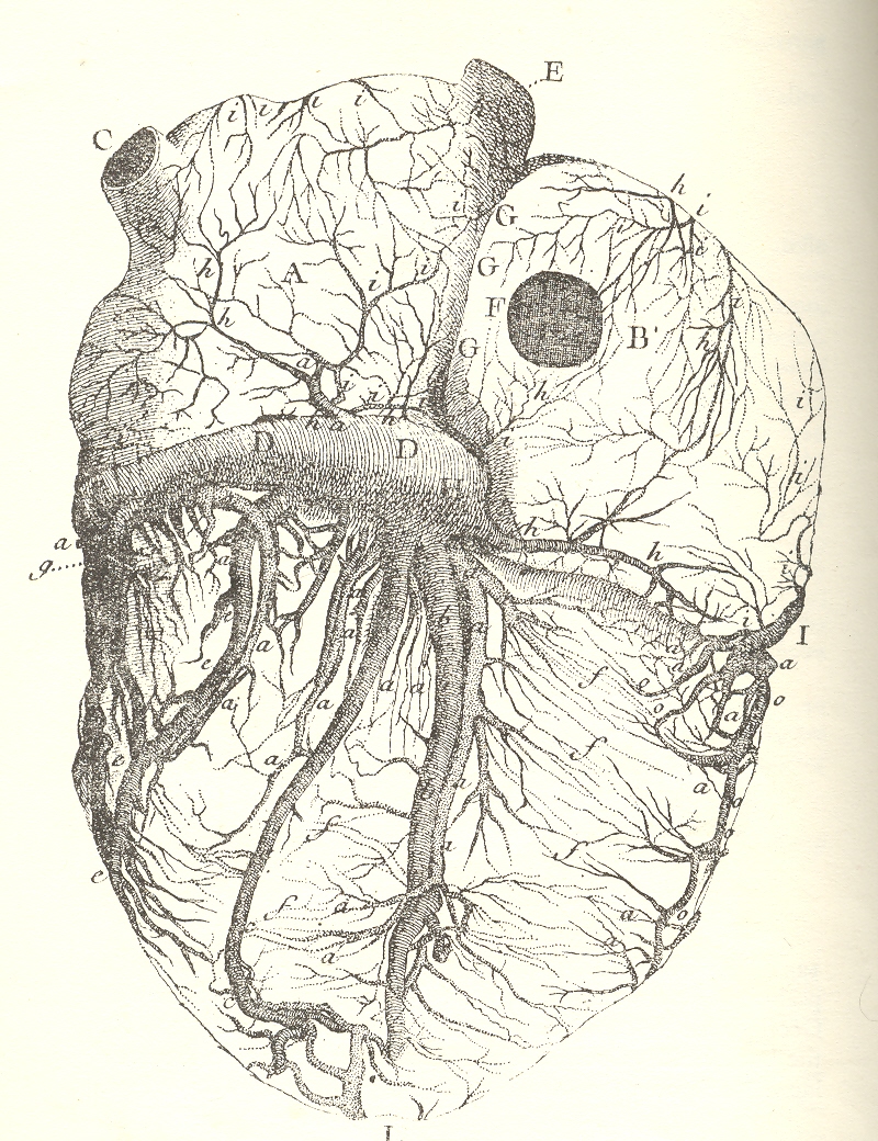
(1693-1773, born in
The next image is the first to properly describe the nerves of the heart, and was published in the magnificent Antonio Scarpa’s Tabulae neurologicae ad illustrandam historiam anatomicam cardiacorum… in 1794. Scarpa was a monumentally
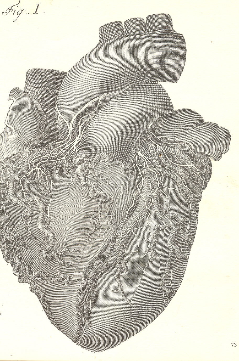
accomplished anatomist who was also a gifted artist, and it is his own work that illustrates this masterpiece. The original edition of this work is huge, atlas-sized, and the images of the heart are life-size and float in plenty of free, very wide and perfect margins.
On the other end of the spectrum we have this liturgical
philosophical anatomy of the stages of the heart in grace and disgrace. Mostly I’m interested in the foul part, which
shows the advanced mortification of the organ in seating the throne of Satan. The
edition here is The Heart of Man, either
a
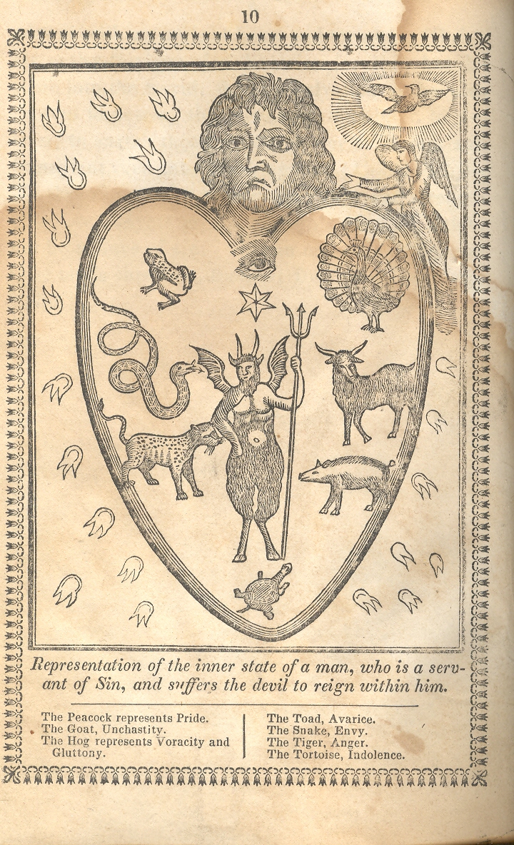
The first image shows the heart of man completely dominated by Satan, with Man the sinner’s troubled face (along with the mark of Cain (dominating his wayward organ. The emblematic animals infesting his heart include the peacock (with its misleading haughtiness), goat (“a lascivicious, stinking animal” representing “unchastity” and impurity), hog (gluttony and intemperance), snake (seducer), tiger (cruelty and ferocity) and tortoise (indolence). They chase from the hear the holy ghost and an angel, and allow the presence of Satan (front and center).
The second image is interesting in that it shows the movement of a bad/evil/wicked heart to a more pious one, though it is just in the transition stages. In my experience it is uncommon to see an emblematic illustration of a half-way point of, well, anything; this woodcut seems to capture, to be a snapshot so to speak, of the human heart undergoing transformation.
Notes: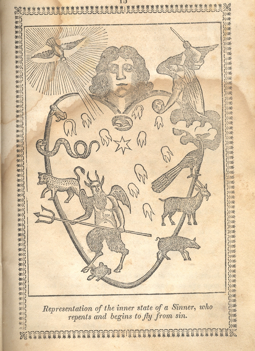
1. The original title was something along the lines of Spiritual Mirror of Morality, in which every Christian, who desires his salvation, may view himself, know the state of his soul, and profitably learn to regulate his life according to it. Hardly gender-neutral, the title makes four specific gender references to men.
|
Bulbous & Bubbly Design: Bloated Efforts on Land and in the Sky
JF Ptak Science Books Post 951

Sometimes things are designed that are so bulbous and so inflated and so terribly hyper-packed that they are just destined never to be built beyond the imagination. Among the largest of these things meant for the air was designed by a particularly streamlined designer, Norman Bel Geddes, who basically owned the concept of aerodynamic function at all levels of design in the 1930’s.
But Bel Geddes’ apoetically-named aircraft, Airliner 4, is an entirely different issue. It may possibly be the largest, slowest, lowest, fattest and most lumbering plane ever designed. (And by this I mean that it stood a chance of some sort of actually being built and flown, as opposed to the monsters with wing-topped tennis courts and such.)
This 530'-long 1.2 million pound beast took an hour to climb to its max ceiling of 10,000 feet where it would cruise along at an astonishing 100 mph. It would wind its way lovingly across the country, slicing off its travel hours like frozen bologna, 30 hours from coast-to-coast, slowly, methodically, so as not to disturb its 600 passengers in their sleeping rooms. But I'm not sure how much sleep would get slept, what with 20 (!) 1900 hp engines screaming overhead.

The passengers who didn't sleep could do a lot besides sit and be serviced by the aircraft's crew of 155--they might actually need guides to get them through the oddness of the plane's 9 decks, 3 kitchens, 2 dining rooms, solarium, 100-couple dance floor, gym, barbershop and medical offices (with waiting room). Plus much, much more. (I like a plane with a doctor's office waiting room; perhaps the real genius would've been to come up with the smaller, more interior, extra waiting room to which one graduates before seeing The Doctor.)
Getting closer to the ground is the plan for the Chicago Civic Center (1909) by the usually accomplished Daniel H. Burnham. This beast looks more like a stubby nuclear- pulse intergalactic Mothership than anything that anyone would have wanted to build on the ground—at least in space it would be out of sight.

In a struggling prose reminiscent of Lewis Sullivan Burnham writes1: “The Civic Center will be dependent for its effectiveness in the character if the architecture displayed in the buildings themselves…” which I think is self-referential, stating that the architecture’s effectiveness is dependent upon the architecture. If this is the case, the enormity of the Civic Center doesn’t save it from itself.
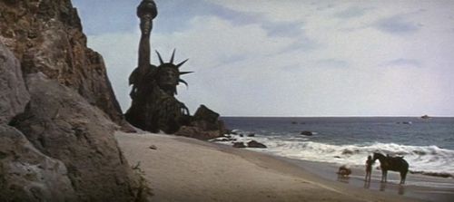
Staying in Chicago we find another proposal, this for the ChicagoTribuneTower competition of 1922—many of the works submitted seem to my eye big and wide and ugly, but perhaps none more so than that offered by Ludwig Koloch. This may well have been a nice design for the top third or so of a building, but not for three thirds--and actually, this may be four-thirds. It reminds me of something rising from the sands at a beach in the future, the remnants of destroyed civilizations. Without the apes.
Notes:
- Daniel Burnham and Edward Bennett, Plan of Chicago, 1909.
|
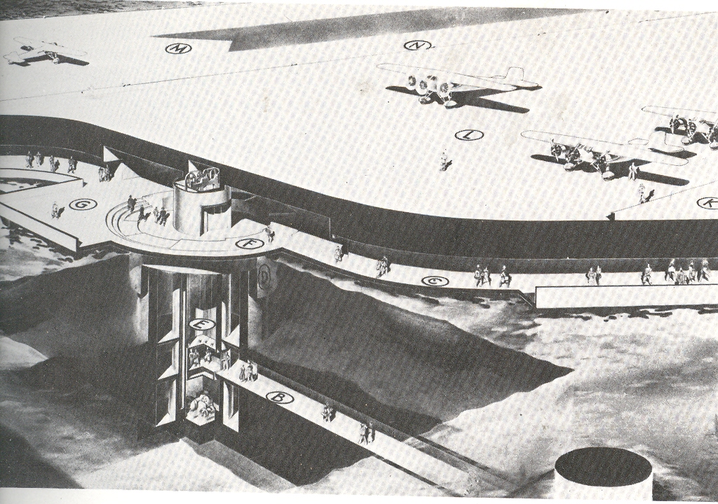
Jobs of the Archaeo-Future: Airport Steerer (Bel Geddes' Floating Airport)
JF Ptak Science Books LLC Post 950
Norman Bel Geddes (1893-1958) made fast, bulbously sleek and varyingly aerodynamic objects and ideas, and was a vastly successful designer of things ranging from sets for the NY Metropolitan Opera House to telephones to cars to locomotives to the housing for the Mark I computer. Ideas were his metier, and there seemed no lack of them--good, mostly; bad, sometimes.
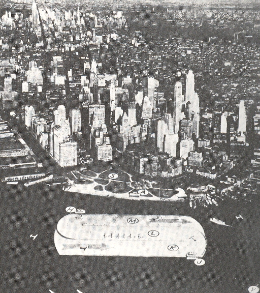
Bud bad ideas can be beautiful, and elegant, if only for a very short period of time in which they might have actually functioned for the good. One of these blisterers was his floating airport for the NYC harbor. Passengers would access the airport via a 800-foot automatic walkway tunnel, and then up to various shuttles and such on the levels below the flight deck. This beast floated on columns floating on mobile caissons just above the harbor bottom, enabling the whole to be turned into or away from the wind, making for easy approaches and departures for the planes. But it is the pilot of the airport that seems most interesting to me, steering the giant propellers that lay under the corners of the structure, pushing the airport into/away from the wind.
This may well be the largest mobile steerable structure moving along the shortest courseway conceived as a possibly-buildable project of the twentieth century.
Associated posts on great and unbuildable architecture:
Gigantic
and Unbuildable Architecture: Philip Johnson and the Walled "
Gigantic
and Unbuildable Buildings: Leroy Buffington, 1889
Fantastic
and Unbuildable Architecture #6: the Pyramids of Gizeh in
Gigantic
and Unbuildable Architecture: Bucky Fuller’s Midtown Manhattan Dome, 1968
|
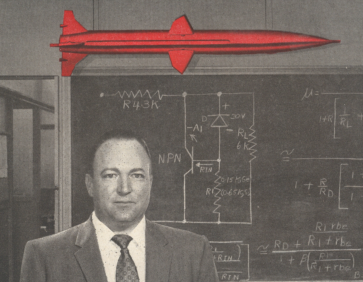
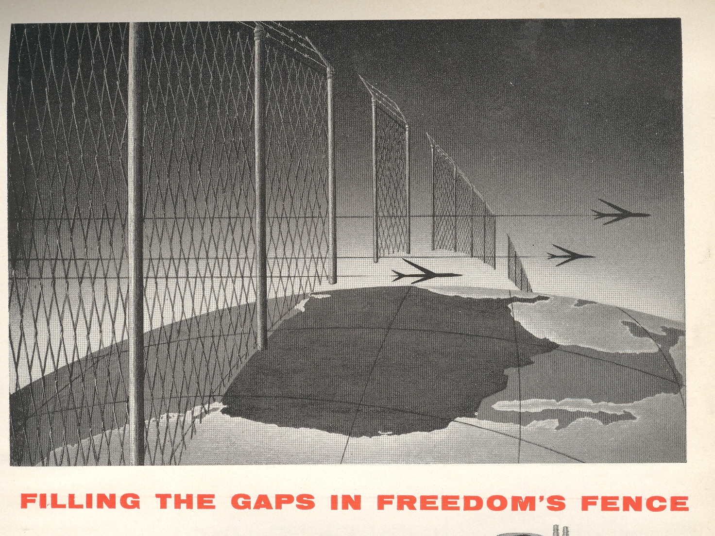
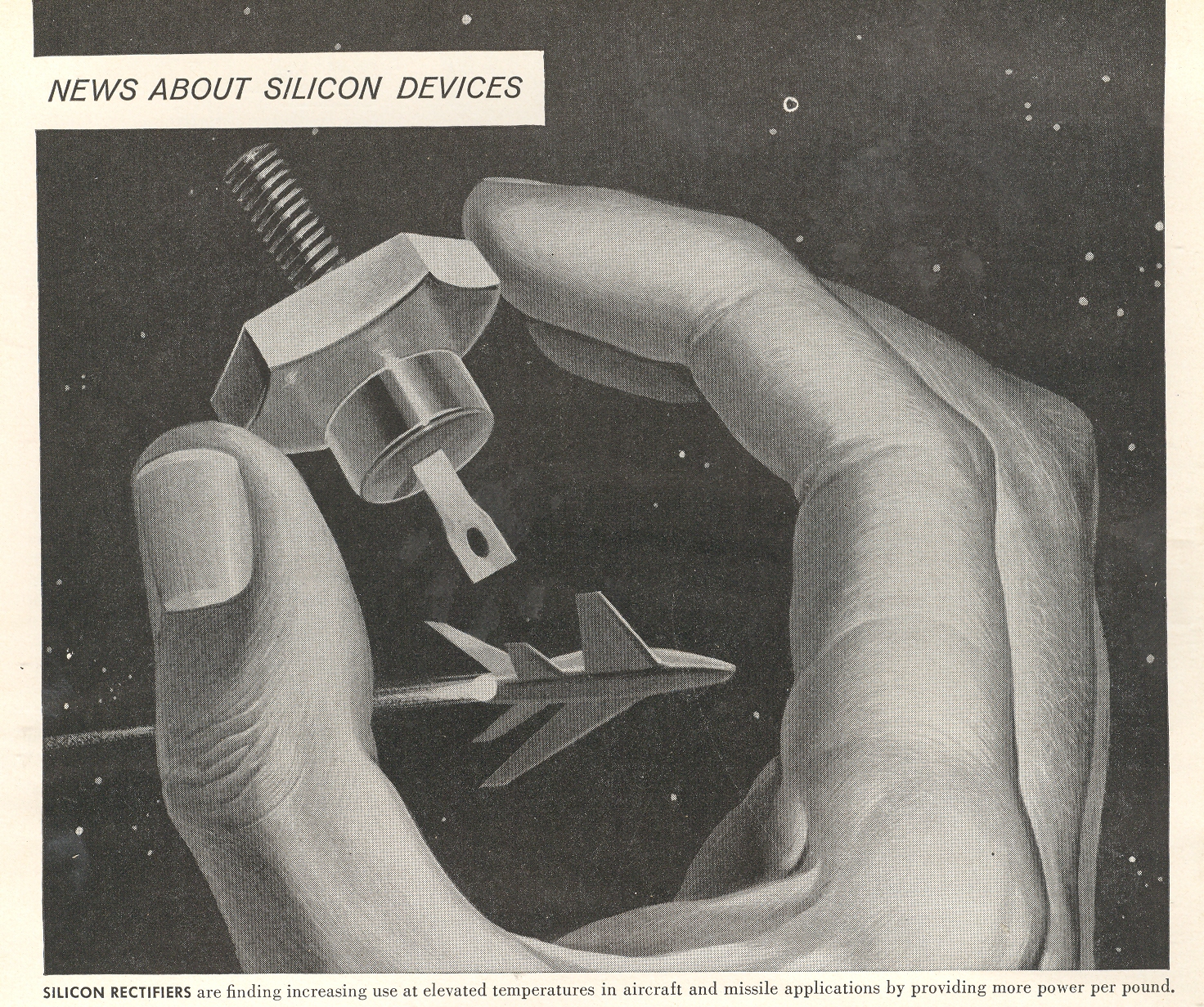
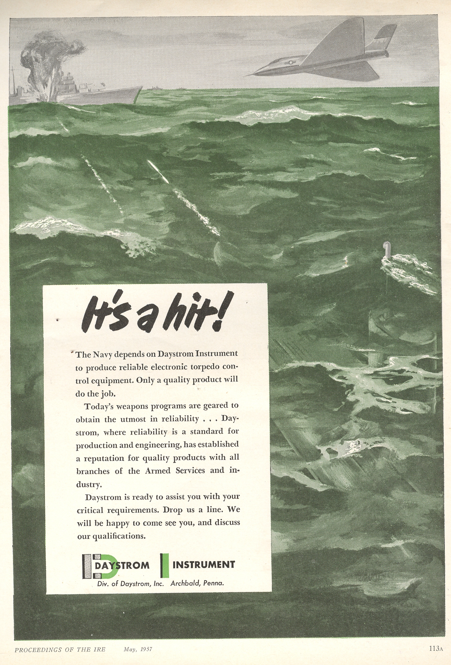
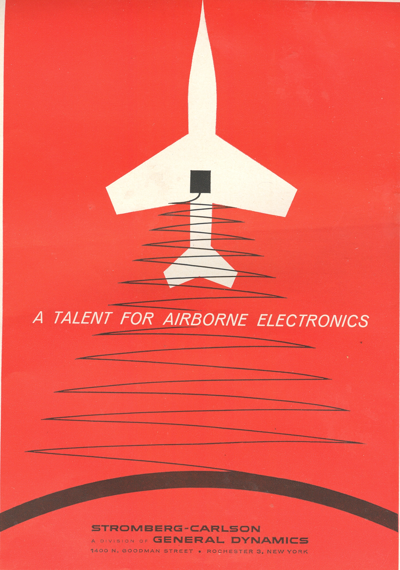
The Care and Feeding of Missile Systems--1950's Ads
JF Ptak Science Books LLC Post 948
The following illustrations are all taken gloriously out of context from ads appearing in the Proceedings of the Institute of Radio Engineers, published in 1957-1958.

|
Bad Sounds Department: the V-1, 1944
I remember seeing a film (with sound) many years ago, when I was little, back in the mid 1960's, of a V-1 in flight. The flying bomb issued a terrifically awful sound, punctuated by the silence when its engine turned off and it fell to its target in silence. It sounds like death.
[The V-1, or Vergeltungswaffe 1, (“retaliation”, or “vengeance” weapon), or Fieseler Fi 103, or Buzz Bomb, or Doodlebug, was a flying bomb (on the order of a very primitive cruise missile guided by a gyroscope autopilot) launched against population centers in England by the Nazis during the June 1944-January 1945 period. The bomb was about 27’ long and 17’ wide, weighed 4,700 pounds, and reached 400 mph with an 1,800 pound warhead. Its 8,000+ sorties killed more than 6,000 people.]
http://www.youtube.com/watch?v=Q1qsBGTkVSk&feature=related And again: And again, here:
|
Magnificent Titles, Ranters and Hell Breaking Loose (England, 1650)
JF Ptak Science Books LLC Post 946
Ranters,
Diggers, Manifestarians, Puritans, Muggletonians, Shakers, Quakers, Levellers, Seekers…terrific names all for religious or religioesque movements, most now
gone, though it seems that of the most-gone the Ranters are probably the
most-goned gone--which must’ve been a function of their unstated aims of not
having a particular course of action. As
an anti-movement their movement was tautologically doomed, as they flourished
for only a decade or so, sandwiched into the very full mid-17th
century.

{The image above is an illustration from the book, Hell Broke Loose... below. It also is a pretty tame version of other images that show more nudity/drinking/sexual activities.]
Ranters
were an English Free Spirited heretical group of wide interpretation of social
and moral value. Their questioning of the potency of the man’s fall doctrine
steamed together with a quasi-semi-millenialism evidently led to an
alehouse-based loosening of socially governed restraints. According to the many People magazine-like pamphlets and soft
porn reporting, their activities made for sugary eating by the bawdy-eyed ha’penny
people buying gossip in cheaply printed formats. Free of Sin and Law, the Ranter celebrations
were soaked in alcohol and nudity, which are ripe pluckings for any non-serious journalist, then or now.
Judging from the list of publications (listed below in the "Continued Reading" section) there must've been a very immediate lusty interest in the Ranters' lustily interesting ways. I've written this post for the simple interest in one particular, extraordinary title: [with apologies for the underlining, but I cannot convince the Typepad gods to remove it.]
Hell broke loose: or, the notorious design of the wicked Ranters, discovered on Sunday last at Black-Fryers Being a true relation of the strange proceedings of Mr. Vaughan, and his wicked proselytes; and their entring of Black-Fryers church in sermon time, like so many spirits from hell, with four damnable papers in the hands, containing such horrible, audacious, and abominable songs, the like not to be parallel'd in former ages. With the manner how this onsolent Ranter traced the streets from Black-Fryers to Saint Paul's Church-yard, in his Holland shirt, without doublet or breeches, a treble cap, like the Pope's miter, with silk fring, and white shooes, and stockings. With their damnable plots, and conspiracies against the ministers of the gospel: their examination before the right honourable the Lord Mayor of London; the sad and woful speeched, made by the ringleader of the Ranters, concerning the city magistrates, and golden chains: and the committing of them to Bridewell till the next sessions. 1650
Continue reading "Magnificent Titles, Ranters and Hell Breaking Loose (England, 1650)" »
|
Architectural Palindromes (or Semordnilap), Reversible Structures and Fractally Bad Ideas
JF Ptak Science Books LLC Post 944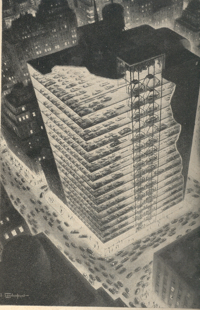
"The Edge... there is no honest way to
explain it because the only people who really know where it is are the ones who
have gone over.
Oddities and Curiosities and the Tryphiodorus Award
Sometimes things that were just done because they could be done aren’t necessarily an accomplishment—they may use letters in the alphabet and make words, but the words really don’t seem to take us anywhere. Literally. There is a literary practice (and I mean this in a medical or forensic sense) in which the writer chooses to not use a particular letter of the alphabet, abandoning it for very private reasons into the dustbin of abandoned alphabet letters. (That dustbin is generally empty until one of these people show up with the idea of filling it, unless of course we expand the dustbin to include punctuation, and then it gets filled rat her quickly (though not in the Steinian sense).)
The work which most filled the alphabet dustbin more than any in history is probably the Odyssey of Tryphiodorus (a Greek grammarian who flourished in Egypt ca. 4th century ACE) effort written in 26 parts, each segment abandoning one letter of the alphabet until each letter had been completely omitted from one section.. The author could have a lot of time by writing this 26-part cycle in all at once, in one part, abandoning all 26 letters at the same time—this may have produced a more elegant result (with the Bellman’s map coming to mind).
 This
Odyssey may have produced a sort of a
lipogramic palindrome, in a squinty-eyed
way.
This
Odyssey may have produced a sort of a
lipogramic palindrome, in a squinty-eyed
way.
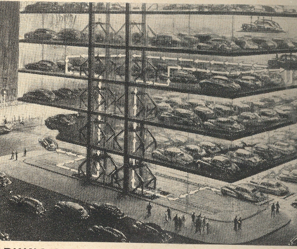
Which
brings me to this odd structure proposed by real estate mogul and hyper-builder William Zeckendorf, whose vision brought to
the pages of LIFE magazine in 1942 (?) a
very tall completely automated structure designed for nothing but car
parking. People would drive to NYC in their own cars (!) and park them in this
car hotel; the car functions would be given over completely to the building, moved
into their spots and juggled and finessed into position by conveyors and forklifts
and such. 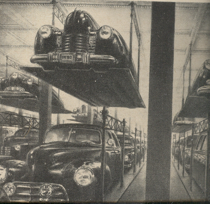
Cars in a building, moved about free of humans, rested; humans on the street making their own human traffic. The whole idea, the entire structure, seems backwards to me, the meaning of a building turned inside out, wanting the essential idea, forwards and backwards being simply a bad notion.
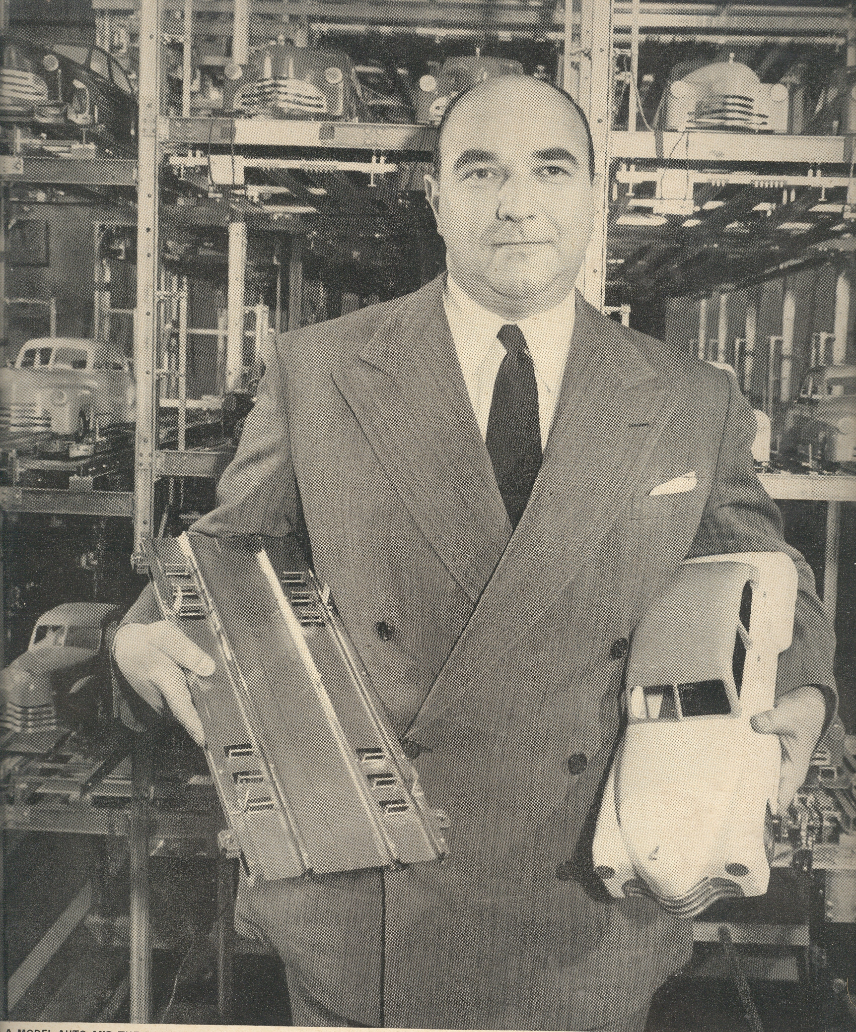
The picture of Mr. Zeckendorf—who was tremendously energetic and who had very many good ideas along with these heavily popularized odd plans—standing in front of a lovely (scale?) model of his parking structure makes me want to see another, smaller version of Mr. Zeckendorf and his model standing just behind it, and smaller one after that, and so on…a fractally bad idea deserving of the Tryphiodorus award for missing the most sense. I bow deeply to Mr. Zeckendorf for trying and for constructing this beautiful (I want it) model.
|
Recent Posts
- On Getting "E=mc^2" Wrong, Twice in 1.5 Square Inches
- Colossus in the Colosseum
- Birds and Human Flight
- Cross-Section of an Arctic-Exploring Balloon, 1890
- The Goubet Submarine, 1886
- A Monumental and Fantastically Bad Idea: Lowering the Mediterranean (1929)
- Two Uncommon Crowd Scenes, 1932 and 1945.
- Mathematical Exercises and Found Art
- Bridges Never Built: the Hudson River Bridge (Midtown) 1896
- An Episode in Antiquarian Depiction of Upside Down Things (1506)
Categories
- Absurdist, Unintentional (726)
- Alphabets (68)
- American History: Western Exploration & Native Americans (60)
- Anticipation, History of (407)
- Architecture and Building (239)
- Art (54)
- Art History (342)
- Astronomy (162)
- Atlas of Dead Ideas (36)
- Atomic and Nuclear weapons (181)
- Aviation & flight (296)
- Bad Ideas (504)
- Beautiful books (31)
- Biology (12)
- Blank and Empty Things; A History of (362)
- Books--Great Cover Art (57)
- Books--title pages, beautiful (35)
- Books: Great & Lost in the Dust (25)
- Books: Title Pages, Unusual (31)
- Boredom, History of (11)
- Brevity and Complexity (51)
- Calculating (59)
- Chemistry, history of (16)
- Children's Art (23)
- Circles, Geometry (6)
- Color & its advanced Abuses (31)
- Color Theory (33)
- Computer Tech/History (130)
- Contraries (11)
- Cross-Sections (51)
- Daily Dose from Dr. Odd (84)
- Economics (8)
- Electro-LUXurious (21)
- Exploration (3)
- Fantastic Beasts and Tales (9)
- Fantastic Titles (45)
- Fear, History of (21)
- Future Punk (27)
- Future, History of the (312)
- German Design (14)
- Histories of Smallness (30)
- History (2)
- History of Dots (72)
- History of Goodbye (61)
- History of Holes (68)
- History of Lines (83)
- History of Memory (32)
- History of Nothing (47)
- History of the Future (346)
- How Fast Stuff Is. (3)
- Iconography (80)
- Imaginary and Impossible, Museum of the (14)
- Impossible Books (35)
- Industrial & Technological art (171)
- Information, Quantitative Display of (618)
- Inventions (66)
- Lines, History of (36)
- Literature (2)
- Magnifcent Mundane (14)
- Manuscripts (6)
- Maps, Cartography, History of Mapmaking (250)
- Maps/Diagrams of Imagination & Ideas (174)
- mathematics, logic (111)
- Medicine, History of (180)
- Memory, Historry of (12)
- Militaria (476)
- Mistakes, The Importance of (7)
- Music (12)
- Mythology (14)
- Naming Things (147)
- Outsider Logic (98)
- Patents (59)
- Perception (187)
- Perspective (199)
- Photography (144)
- Photography, history (69)
- Physics (115)
- Picture Post/Image Dump (5)
- Piles, History of (1)
- Politics, American (3)
- Poster Series (5)
- Prints--looking HARD/deeply at (279)
- Propaganda (55)
- Psychology (20)
- Questionable Quidity (26)
- Reference Tools (39)
- Science (7)
- Social History (292)
- Sports (5)
- Statistics--Fossil, Found, Odd, Forgotten (29)
- Strange Things in the Sky (41)
- Tech-Quiz (15)
- Technology, History of (838)
- Title Page Art, Beautiful (32)
- Travel (3)
- What is It? (14)
- Women, History of (98)
- WORD art (15)
- World War I (247)
- World War II (56)
- Writing Systems (8)
- You Are There (6)
- Zoomology (25)